
The Problem
The parents asked for it. After more than 25 years of operation, two locations, and a growing community, the kindergarten’s website still hadn’t changed. It was the parents — not the team — who said it was time.
The old website was built on WordPress. The client couldn’t update anything beyond uploading blog posts. The design looked like it belonged to a different era. The information was outdated, scattered, and didn’t reflect what the kindergarten had become.
It was embarrassing to send someone to a website that didn’t represent the quality of what was happening inside. But this wasn’t just a redesign problem. The kindergarten needed to serve three completely different audiences: parents considering enrollment, parents whose children were already there, and sponsors and donors supporting the institution.
There was a lot of content and legal requirements. Presenting all of that without overwhelming was the real challenge. Each user group needed different information, different flows, and different calls to action. And all of it needed to happen in a way that felt warm, trustworthy, and simple — not institutional.
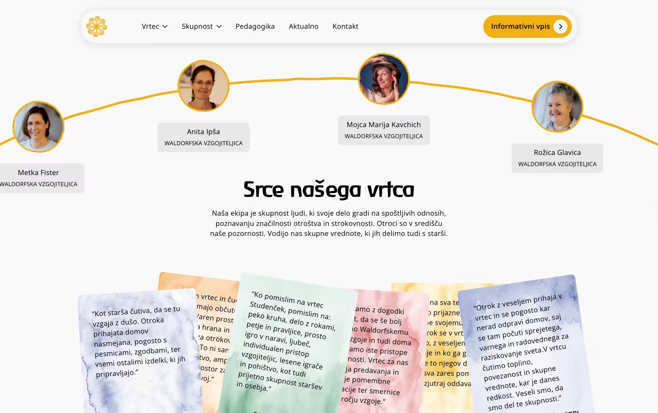
It was embarrassing to send someone to a website that didn’t represent the quality of what was happening inside. But this wasn’t just a redesign problem. The kindergarten needed to serve three completely different audiences: parents considering enrollment, parents whose children were already there, and sponsors and donors supporting the institution.
There was a lot of content and legal requirements. Presenting all of that without overwhelming was the real challenge. Each user group needed different information, different flows, and different calls to action. And all of it needed to happen in a way that felt warm, trustworthy, and simple — not institutional.

The Strategy
The process was the same as always — strategy first, then structure, then design, then development. The challenge was the volume.


The discovery phase gave us the full picture: identity, values, audience, competitors, and goals. From there, we built a guide covering everything. Competitors buried the important stuff. Pricing hidden behind contact forms, schedules impossible to find, enrollment processes explained nowhere. We built the structure around the questions parents actually ask.
The structure needed to support three distinct user journeys. New parents researching kindergartens follow a very different path than existing parents looking for a menu or a form. Sponsors and donors need something else entirely. The sitemap, the navigation, the page structure, and even individual sections were designed around these very different audiences.
Waldorf kindergartens can easily sound too spiritual, too academic, or too closed-off. The client’s actual personality was warm, practical, and professional. The copy and design needed to reflect that — not the stereotype.
The Decisions
A kindergarten website sounds simple. But when the site needs to serve different needs every decision carries weight. These are the ones that kept it from becoming a mess.


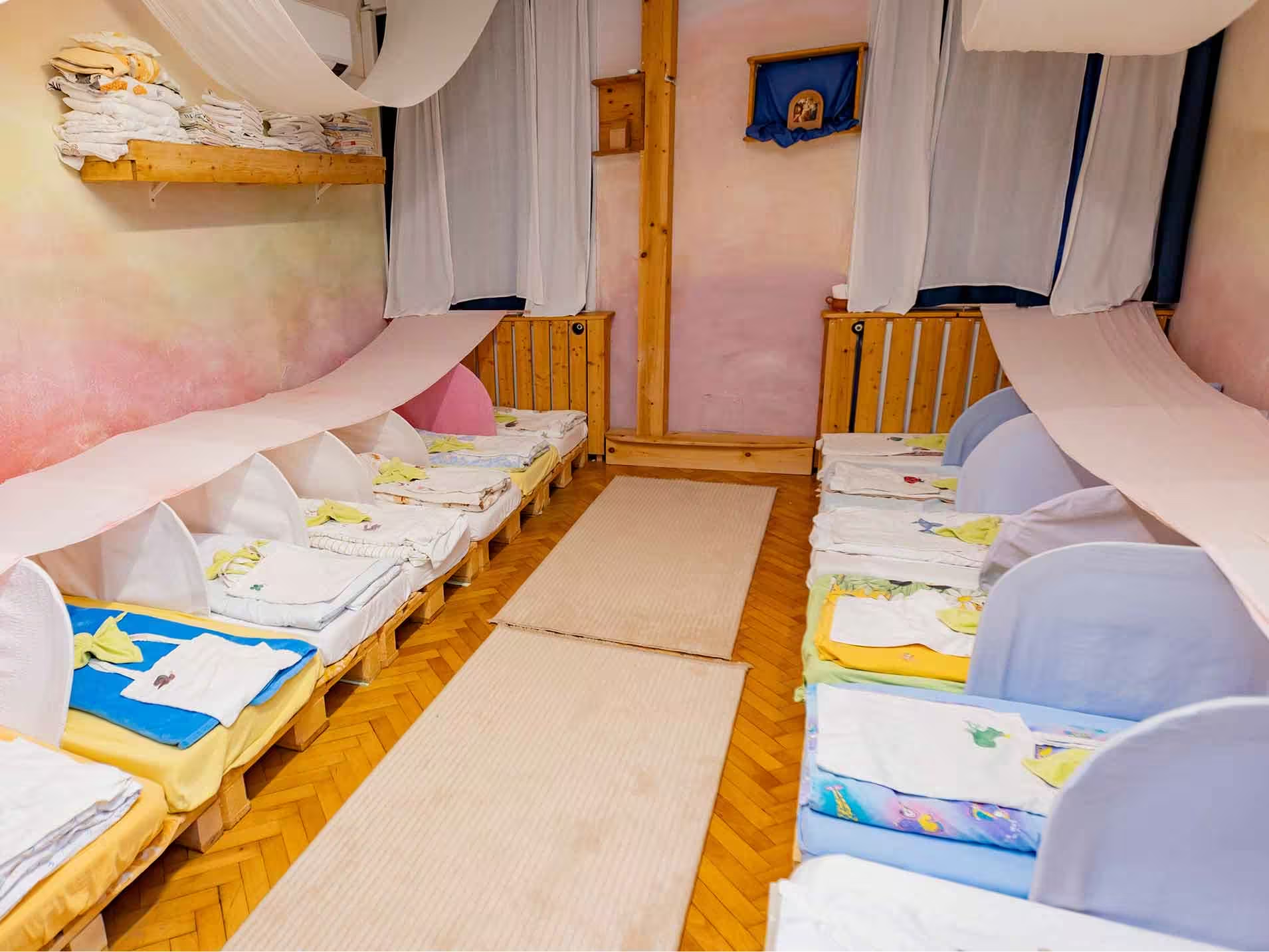
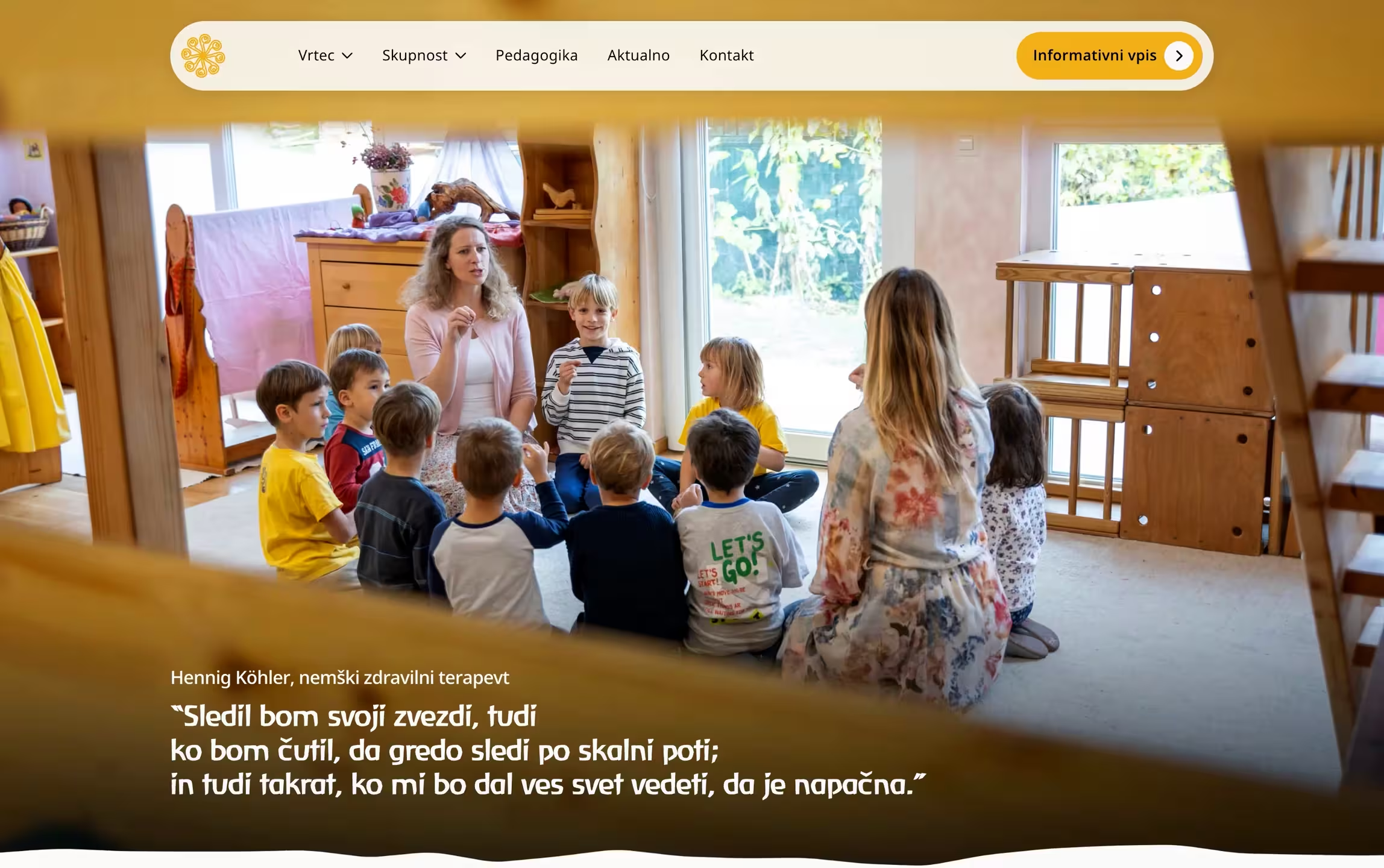

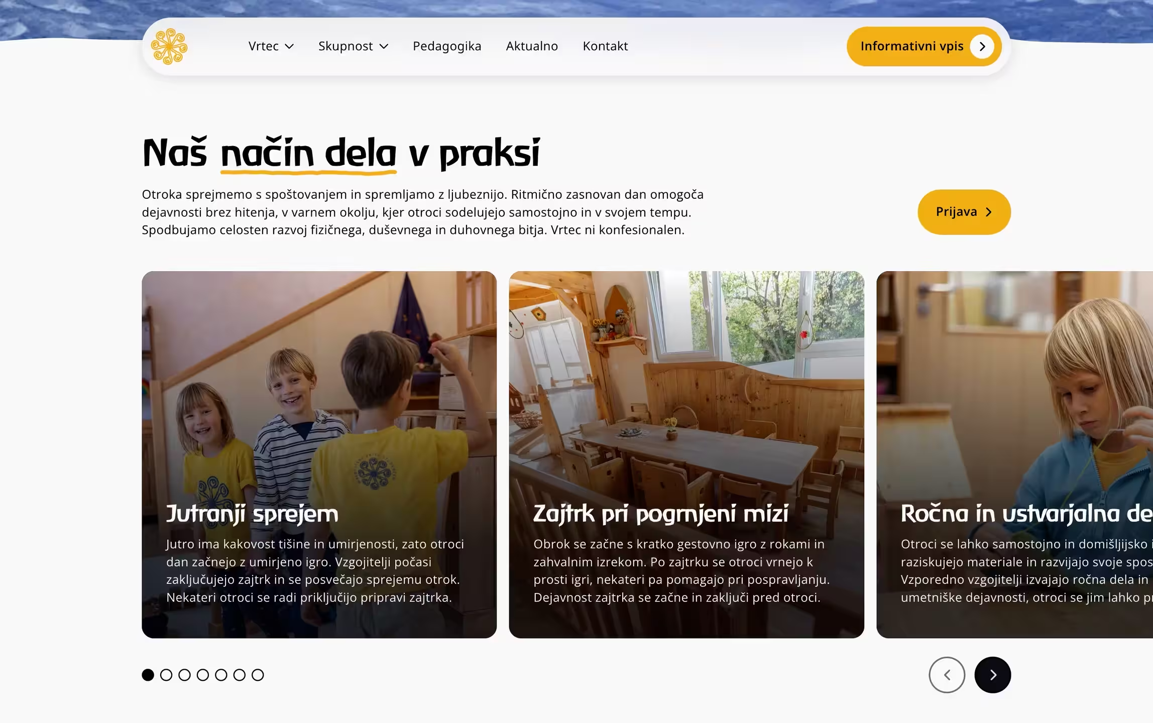
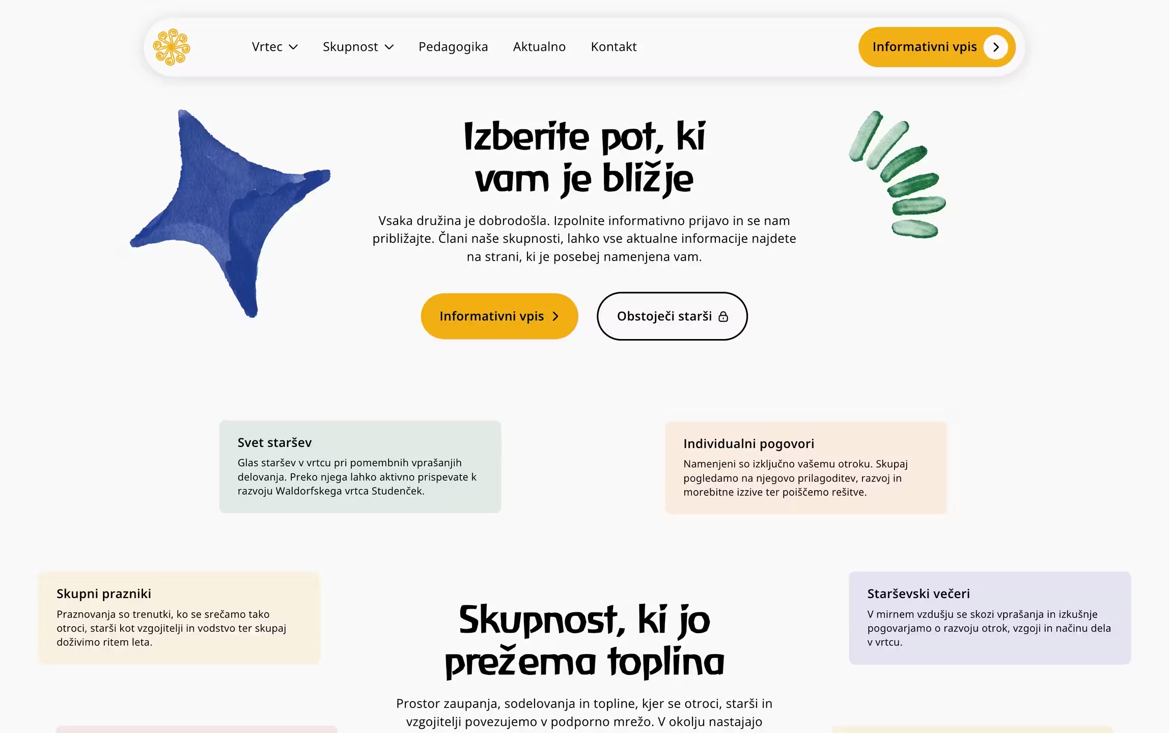
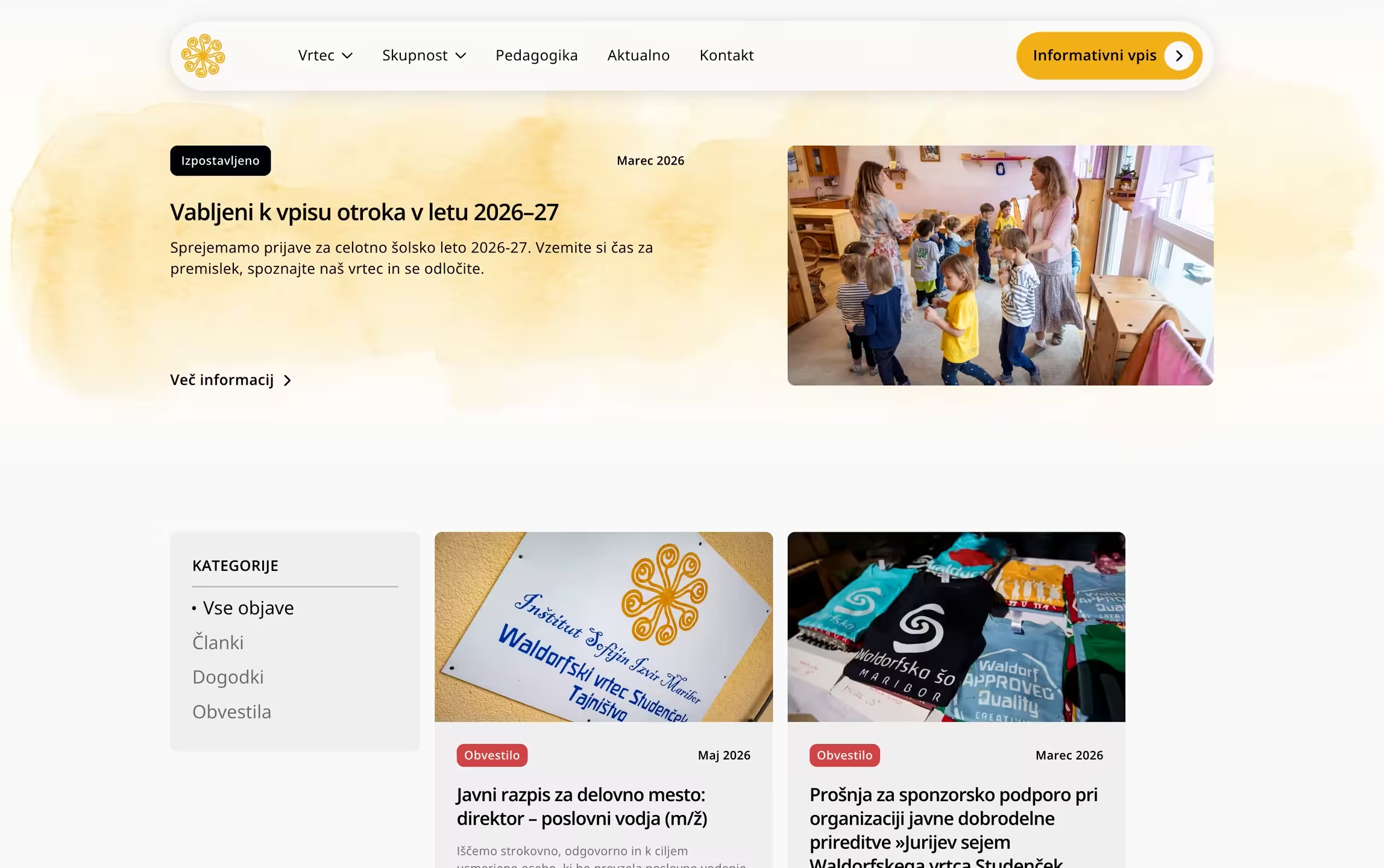
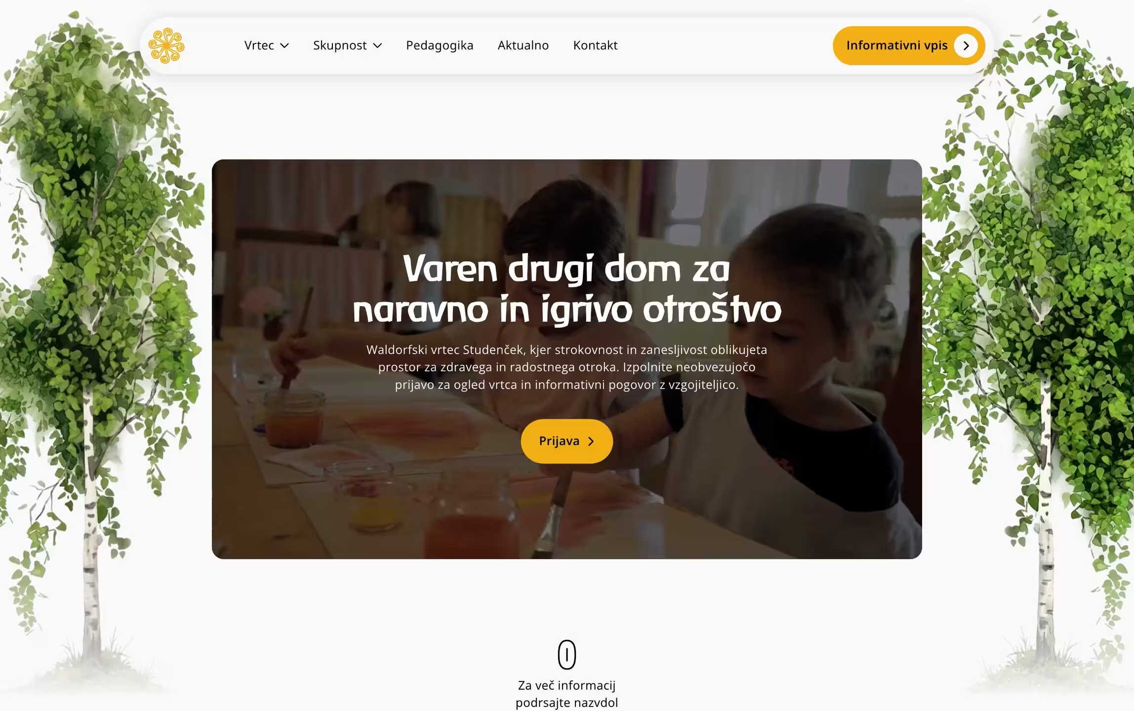
The kindergarten already had visual elements worth keeping — a Waldorf-specific typeface and a color palette tied to their existing identity. We didn’t throw them out. We optimized the typeface for screen use, adjusted the colors for readability, and built a design system around what was already there.
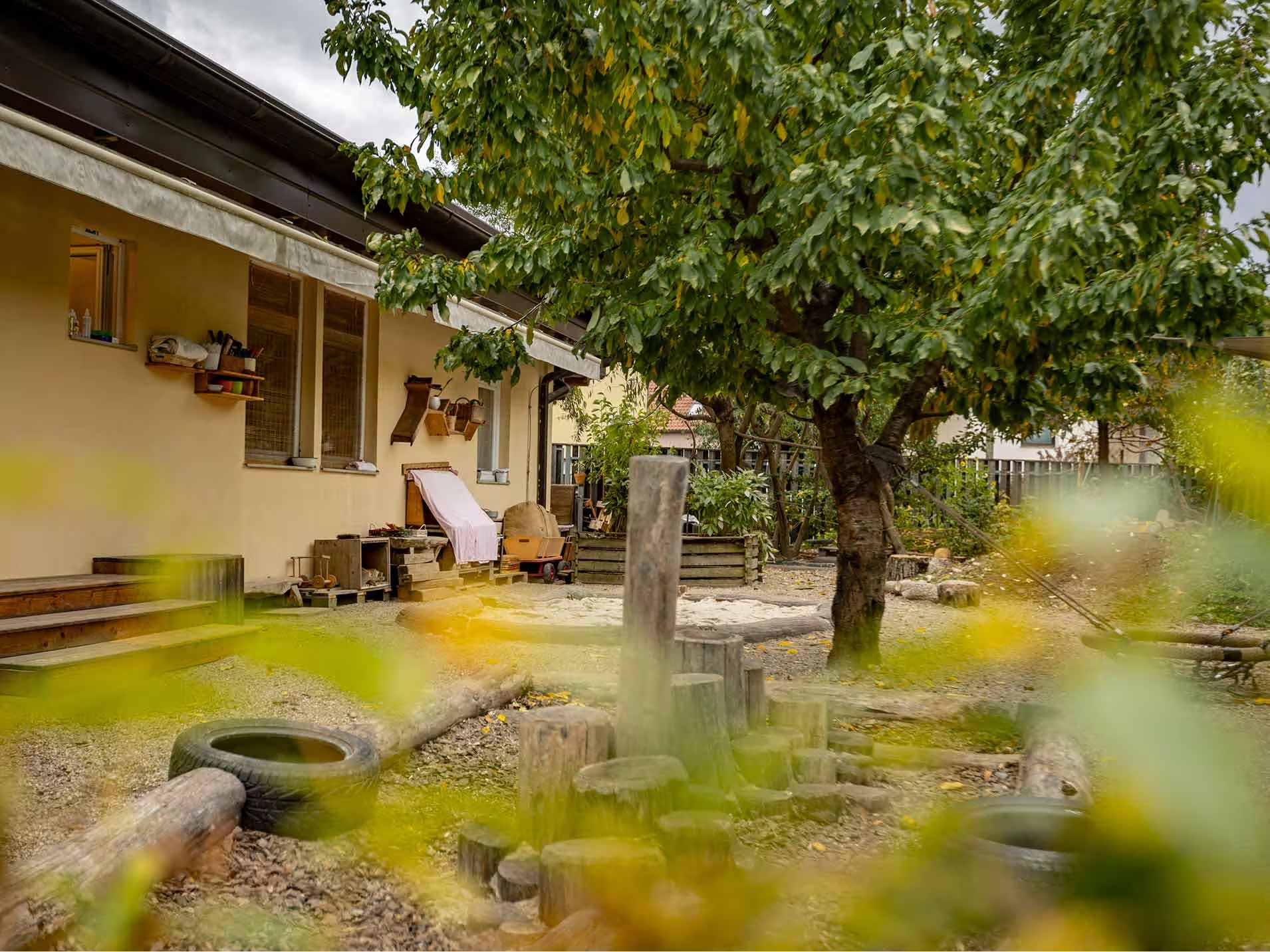
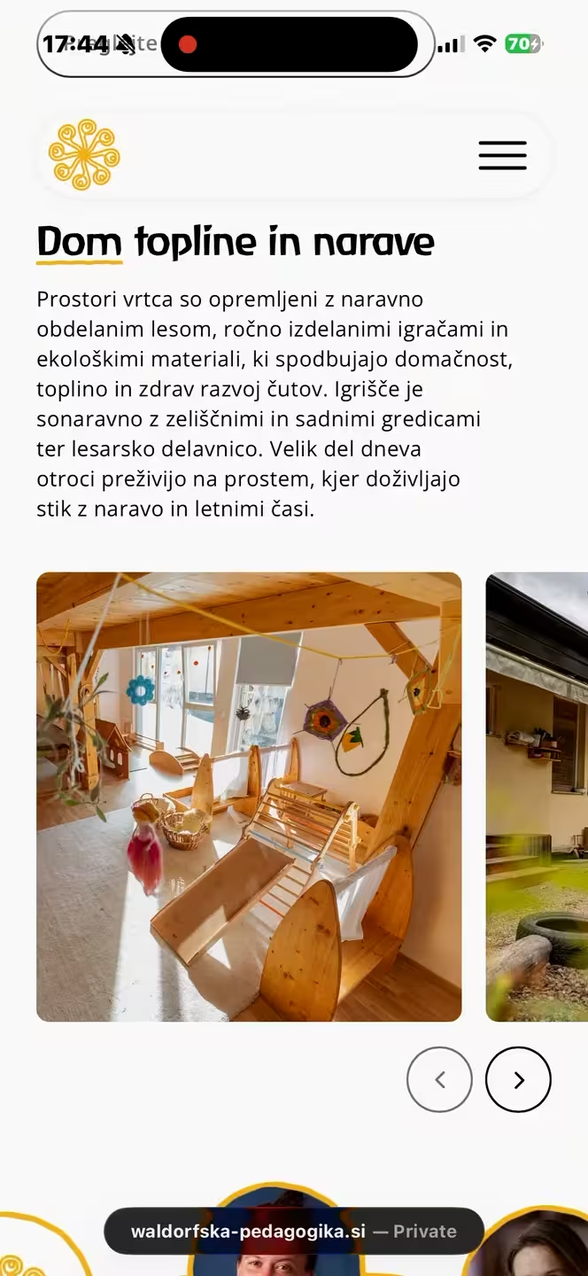
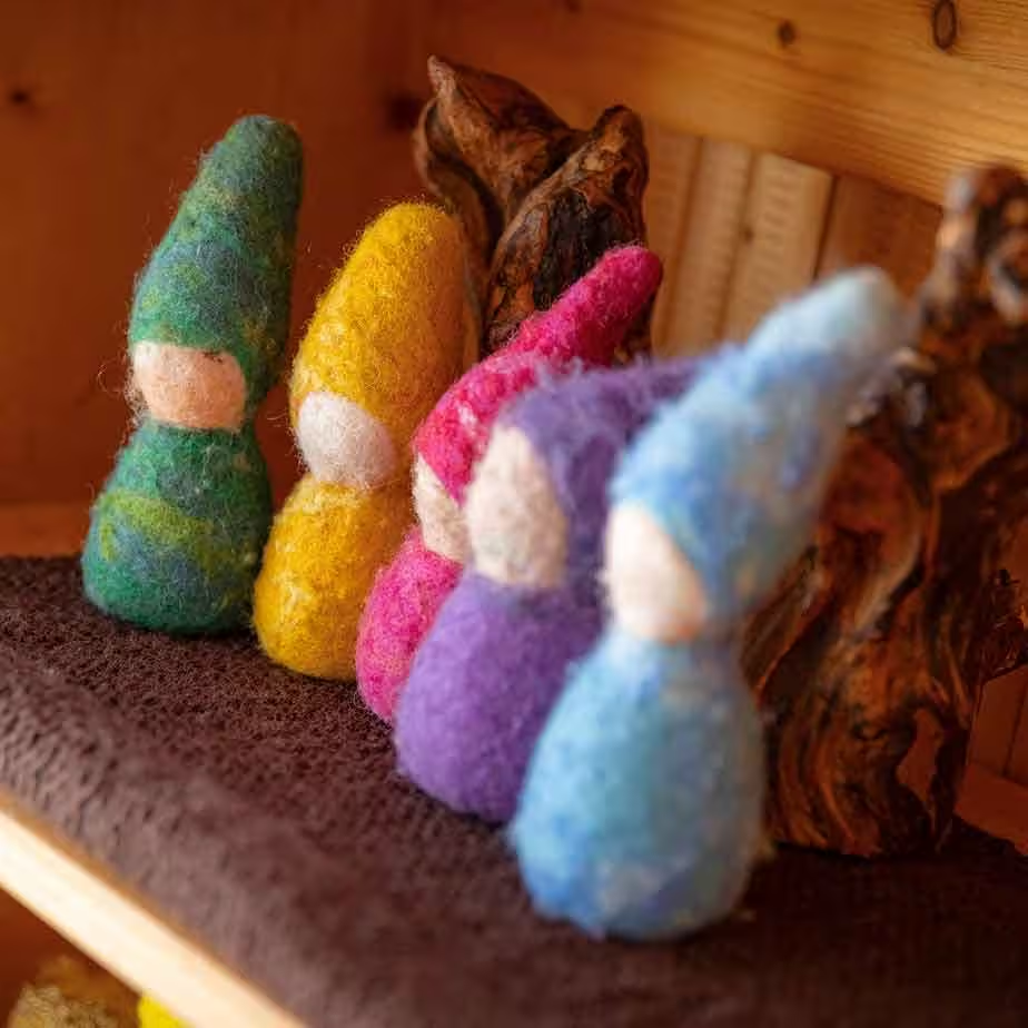
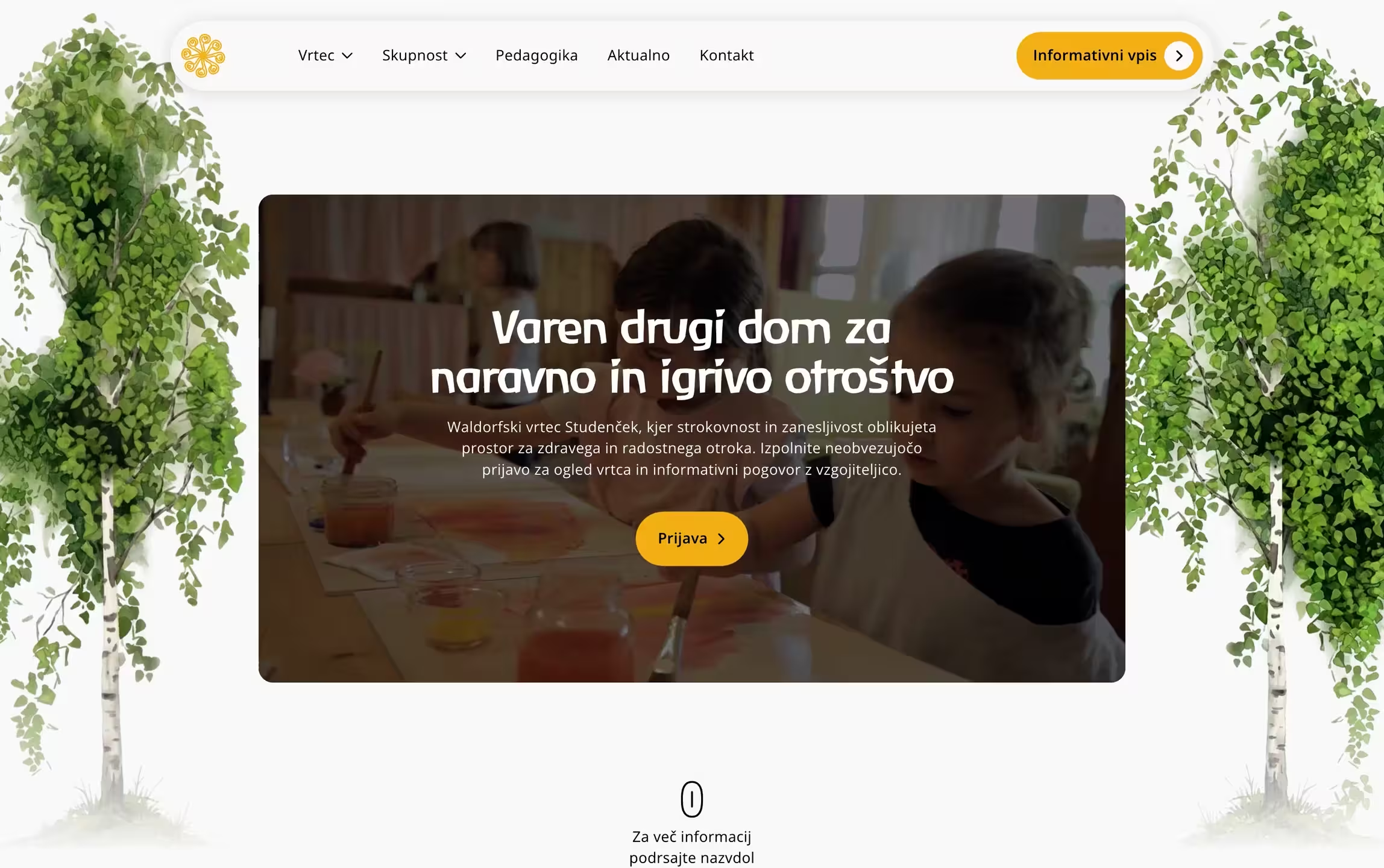
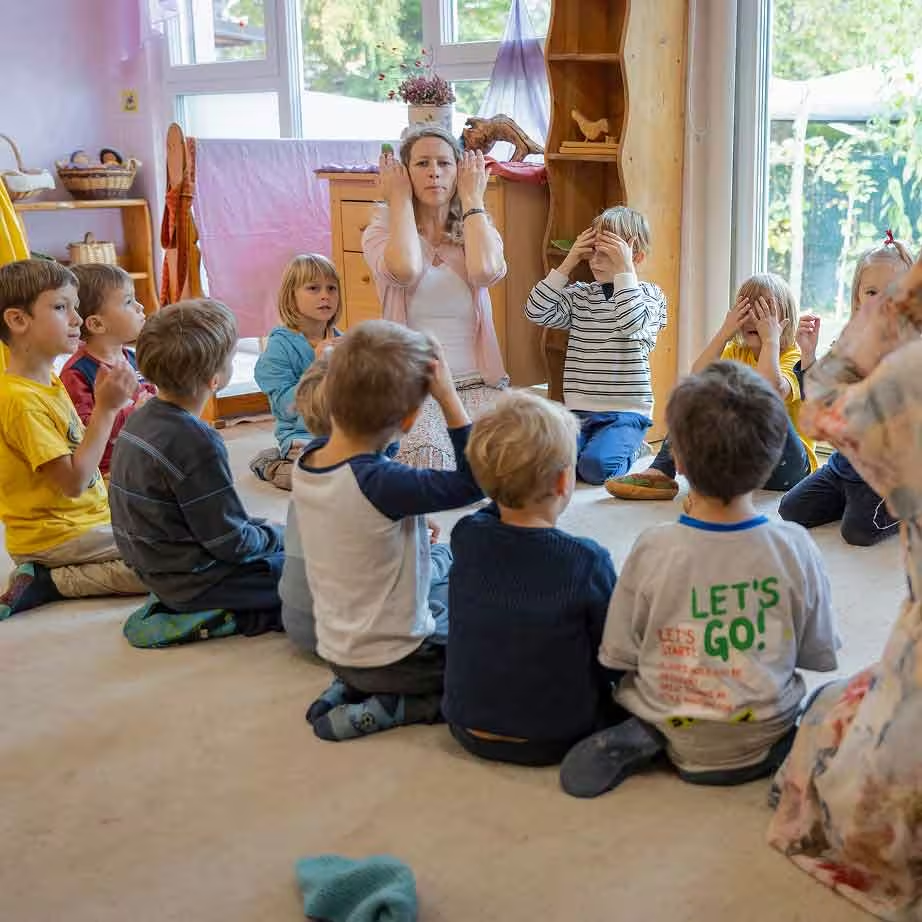
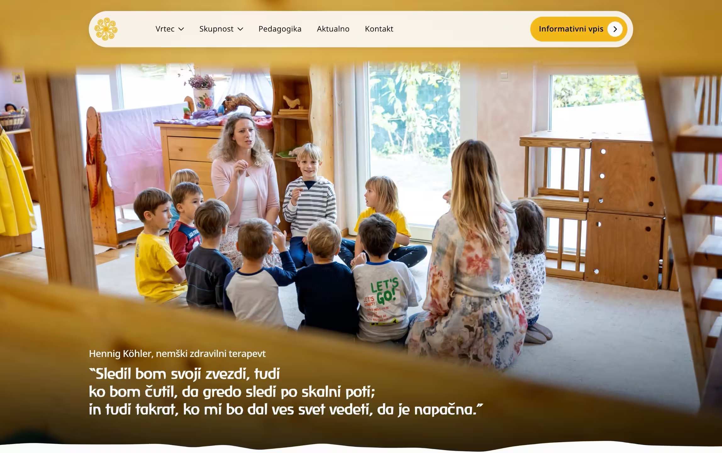
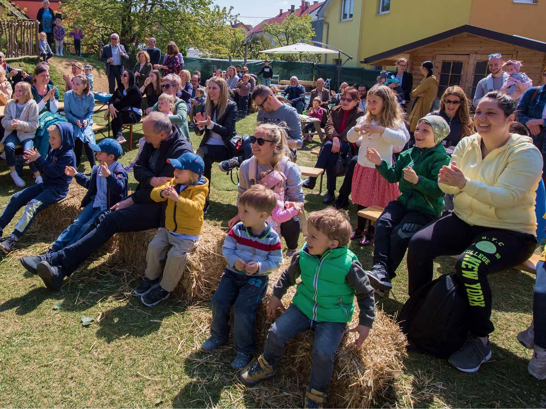
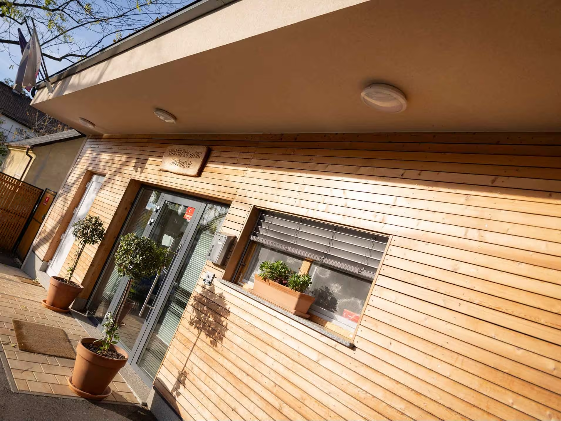
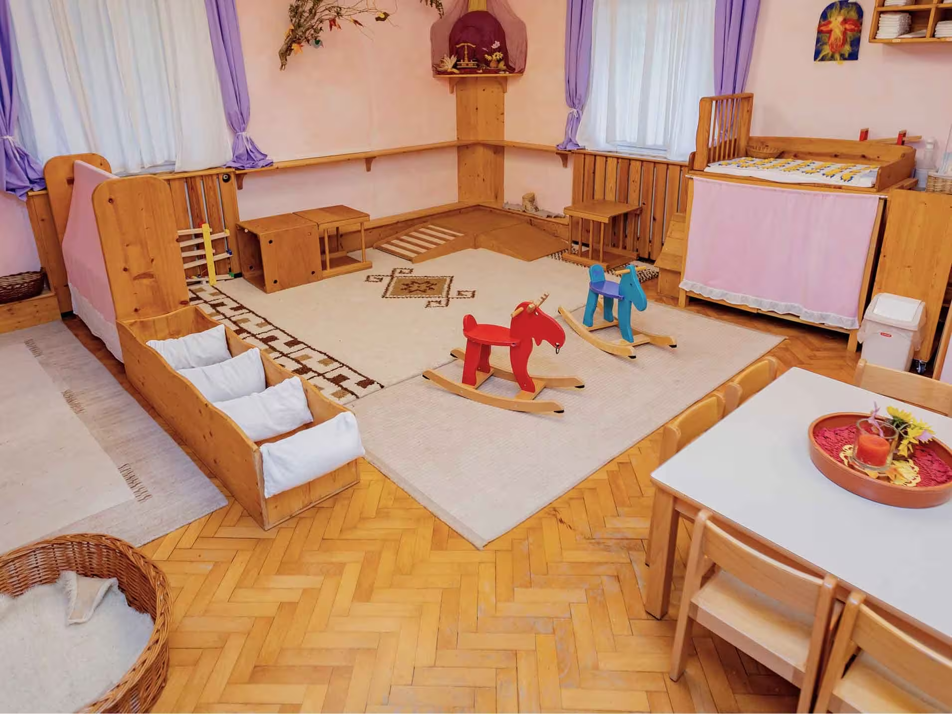
The visual language pairs organic, playful elements — hand-drawn lines, watercolor illustrations — with clean, structured layouts that keep the content easy to scan. Photography does the heavy lifting. Real children, real spaces, real materials. Every photo shows the kindergarten as it is.
The result is a site that feels trustworthy and human at the same time. Warm enough that a parent feels at ease. Professional enough that they don’t question the quality. A kindergarten website that doesn’t look like a kindergarten website, but still feels exactly like one.
There’s a lot of content a kindergarten needs to communicate. The job was presenting all of it without burying people.
We broke the content into sections that match how parents actually think. “What does a day look like?” became a visual walkthrough from morning arrival to afternoon pick-up. “What does it cost?” became a direct, scannable pricing page with custom tabs widget. Every section was designed to answer one question and get out of the way.
The client planned to write the copy themselves. But the volume was large, the structure was specific, and running a kindergarten doesn’t leave much time for writing. We took it over — grounded in the strategy, written in the tone we’d defined together.
New parents get the homepage flow — hero, enrollment status, benefits, daily rhythm, testimonials, CTA — designed to answer their questions in order and lead them toward an inquiry. Existing parents get a password-protected page with Google calendars organized by children’s group, downloadable documents, important forms, and a feedback opportunity.
Sponsors and donors get dedicated sections and pages explaining what the funds support, with visibility into existing partnerships and a clear form to get involved.
Each audience gets what they need without running into content meant for someone else. The navigation reflects this split. “Kindergarten” covers about, enrollment, food, pricing, and house rules. “Community” covers parents, sponsors, and donors. Clean direction, no confusion about where to go.
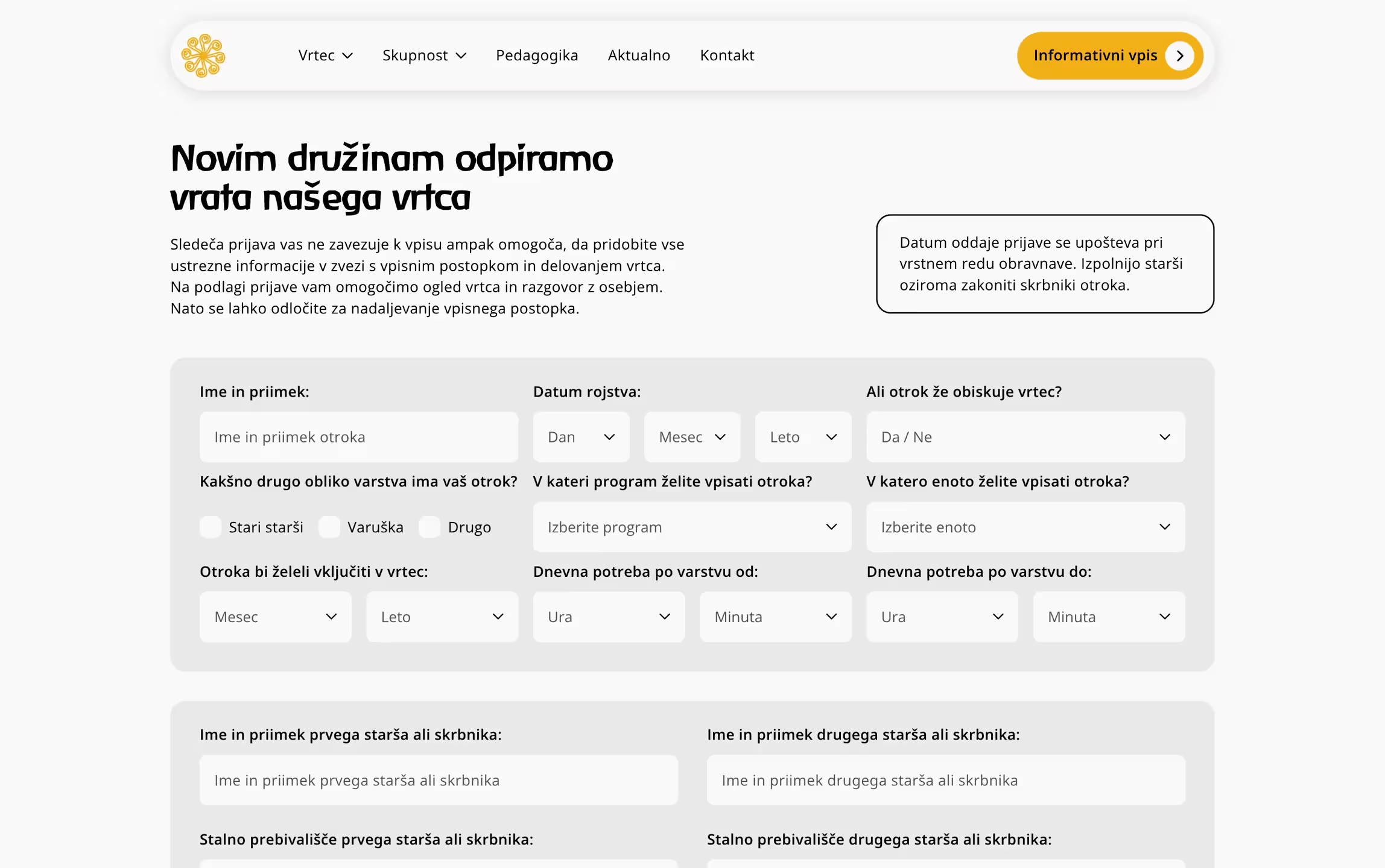
The enrollment form is complex by nature — it collects detailed family and child information for a legal process. We built it to feel simple anyway. Beyond enrollment, we set up forms for contact, sponsor inquiries, and parent feedback — each with a different purpose and a different recipient on the client’s side.
Every form has custom email automation behind it. Submissions arrive structured and ready for the right person. No forwarding, no copy-pasting from generic notification emails. It replaced a manual workflow that had been running on habit alone.
The forms changed how the kindergarten handles incoming communication. What used to require multiple steps and handoffs now goes straight to the right person in the right format.
We built CMS collections for blog posts, available spots, team members, testimonials, and parent documents. Two stand out.
Available spots need to be updated constantly — it’s a legal requirement. We set it up so the client changes one number in one place and it updates everywhere across the site. No hunting through pages and risk of inconsistency.
The blog supports three post types — articles, events, and notices — all within a single CMS collection, handled by conditional visibility. One system to manage, three distinct content types on the front end. The team can publish a new article, event, or notice without even understanding how it works. Full control over the content, no risk to the structure.
The Results
The site immediately did what it was built to do — bringing parents in, giving them what they need, and getting them to act.
Within days, parents from the surrounding area were finding the site on their own. Most of them didn’t just visit — they read, explored, and returned.
Submissions in first 60 days after launch: enrollments, contact requests, sponsor forms, and parent feedback. Before people used email — now they use dedicated forms.
Accessibility was a requirement from the start. The kindergarten operates under strict legal standards that make it non-negotiable.

“Working together has been and is still a pleasure. They’re professional, genuinely invested in the work, and respectful of deadlines and agreements. Beyond the creativity and technical skill, what stood out was their willingness to listen and to help us think through our whole strategy with the website as a key part.”