Osnova


Heritage, quality, and personal service — wrapped in a brand that looked like none of it.


The Problem
Osnova had been in business for over 20 years. A family-run company, selling professional workwear to best restaurants, hotels, clinics, and business across the country. The service was better than anything the competition offered. The brand wasn’t.
The founder had spent more than 30 years in the textile industry and had built strong, long-standing relationships with clients who kept coming back — not because of the marketing, but because of the experience.
Osnova had an outdated logo, no visual system, no guidelines, and nothing that tied their materials together. The quality of the products and the care behind the service had no visual equivalent — a client seeing Osnova for the first time would never guess this was the same company that walked into your office, showed you the fabric, and had the order ready in a week.
For a business built on trust and personal relationships, it didn’t matter — as long as every client came through word of mouth. But Osnova wanted to grow beyond referrals — build a digital presence, eventually move into e-commerce, and reach new clients who would find them online before ever meeting them in person. The brand needed to get there first.
Osnova had an outdated logo, no visual system, no guidelines, and nothing that tied their materials together. The quality of the products and the care behind the service had no visual equivalent — a client seeing Osnova for the first time would never guess this was the same company that walked into your office, showed you the fabric, and had the order ready in a week.
For a business built on trust and personal relationships, it didn’t matter — as long as every client came through word of mouth. But Osnova wanted to grow beyond referrals — build a digital presence, eventually move into e-commerce, and reach new clients who would find them online before ever meeting them in person. The brand needed to get there first.

The Strategy
They knew the business inside out. They just hadn’t written any of it down. The strategy was about giving 20 years of instinct a structure we could design from.



Through questionnaires and conversations, we worked through who Osnova is, why the business exists, what makes it different, and who it’s actually for.
The audience work went furthest. Osnova doesn’t sell to one type of buyer. They sell to different industries that care about different things, find Osnova through different channels, and need to hear a different message. We built detailed personas for buyer types and mapped what matters to each one — their awareness, objections, and decision-making process.
The competitive analysis backed it up. Competitors were all competing on price or breadth of catalogue. None of them were emphasizing personal service, quality of materials, or the consultative process. Nobody was positioning themselves as the premium, relationship-first partner. Osnova was already operating that way. They just weren’t saying it.
The Decisions
A brand built on years of reputation and tradition can’t just look good. It has to feel right to the clients who already know the business and the people behind it.
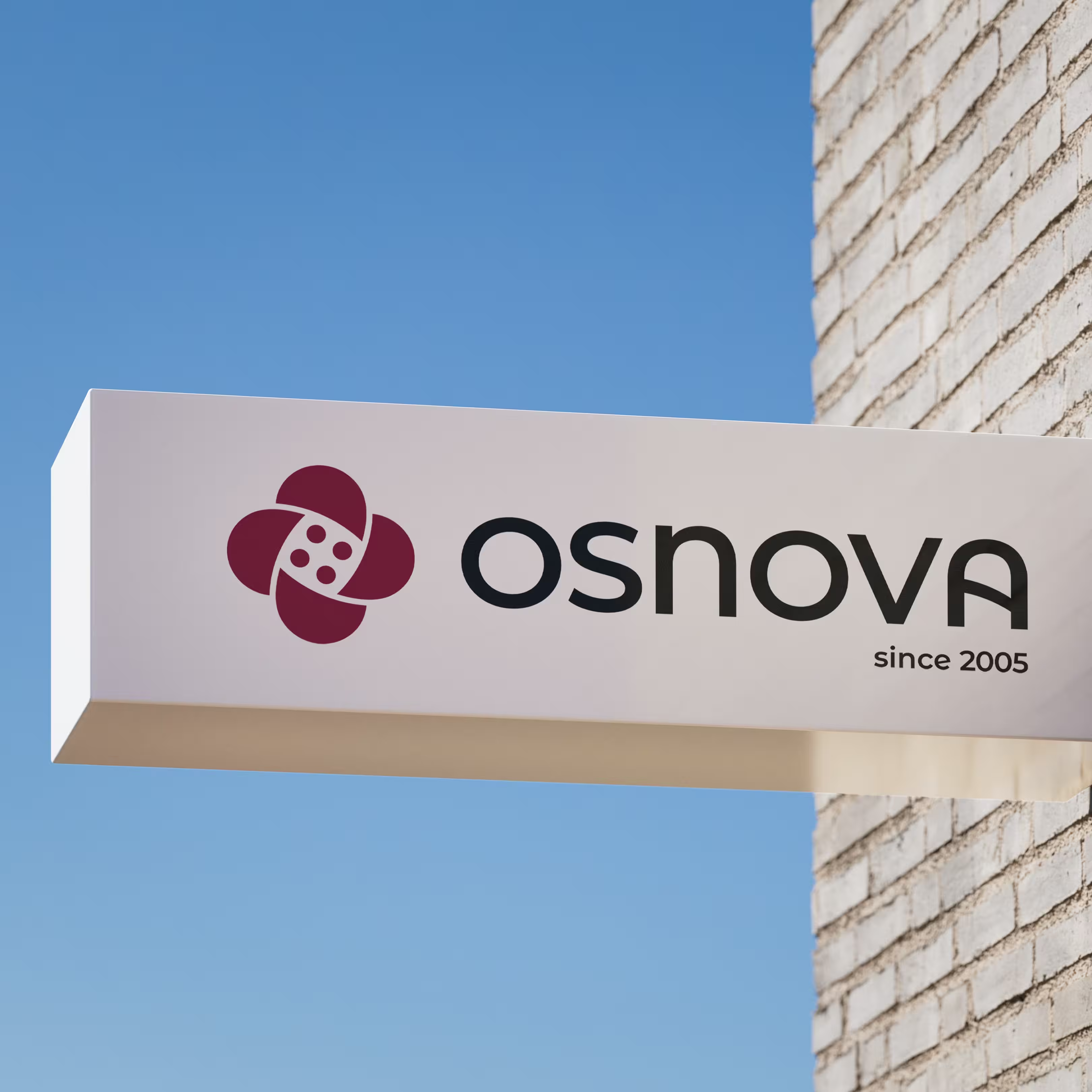

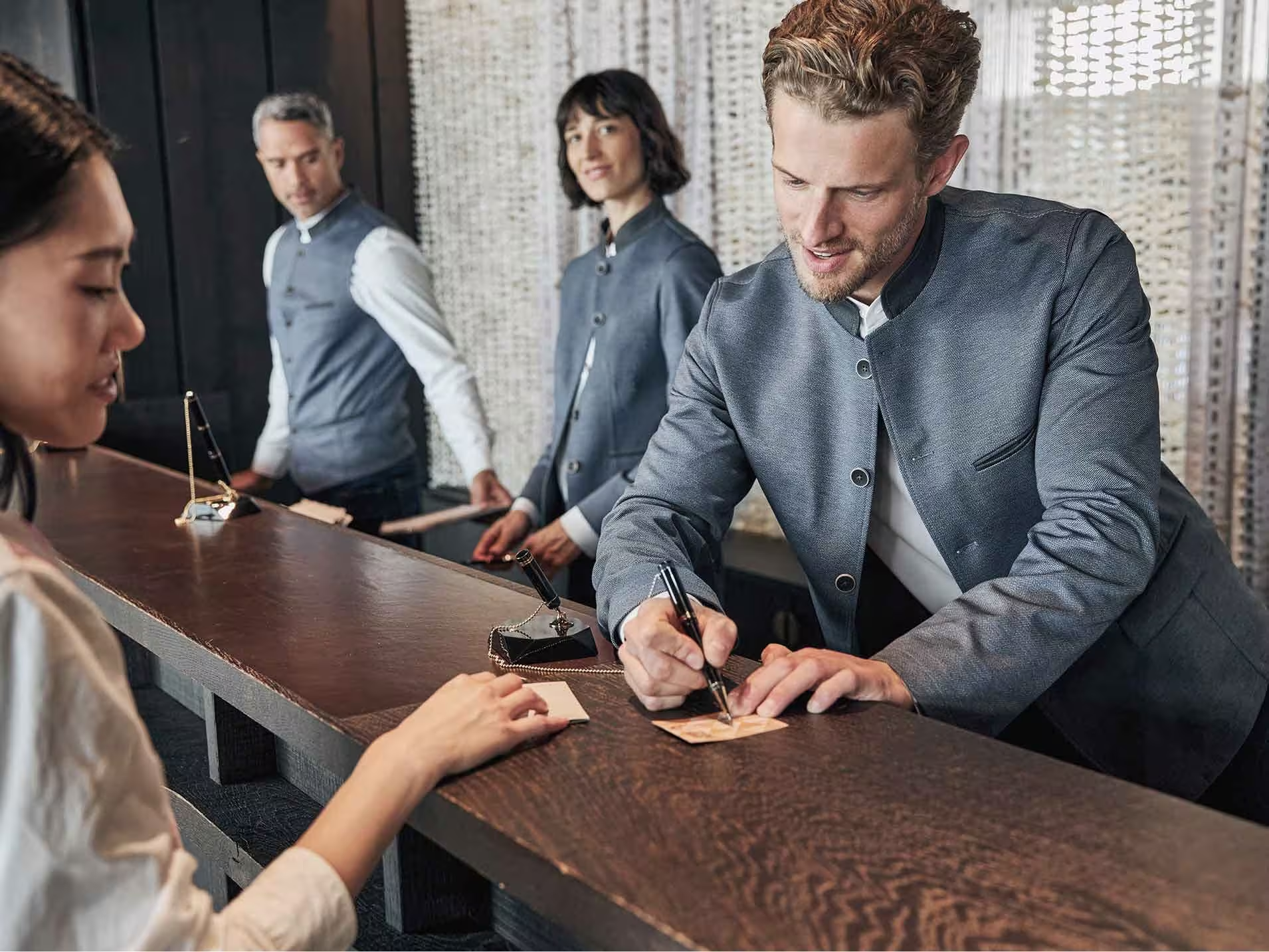






We presented two creative directions. The first leaned into structure and industrial precision — editorial layouts, strong typography, a European aesthetic built on clarity and detail. The second was warmer and more human — minimalism, natural textures, a focus on connection and comfort. Each one captured something real, but neither one was the full picture.
The client’s response landed in the middle. Osnova isn’t cold and corporate, but it isn’t soft either. It’s a company that does professional work in a personal, relationship-driven way. The identity needed to carry both of those things at once.
We combined the two directions. The structural clarity and typographic discipline came from the first. The warmth, materiality, and human tone came from the second. The result was a visual language that feels both sharp and approachable.
The logo mark was constructed entirely using golden ratio proportions, giving it a natural balance that holds up at any size. It’s built from three specific references: cotton, textile, and a button. Cotton represents natural materials and comfort. Textile represents quality, precision, and the structure of garment-making. The button represents functionality, attention to detail, and the element that holds everything together.
These aren’t arbitrary choices. Each reference maps directly to something in the brand strategy — cotton to the product quality Osnova is known for, textile to the craft and tradition behind the business, and the button to the practical, detail-oriented service that sets them apart.
The wordmark was set in a typeface that reinforces the same qualities: reliability, modernity, and straightforward confidence. A vertical variation was designed for contexts where horizontal placement doesn’t work.
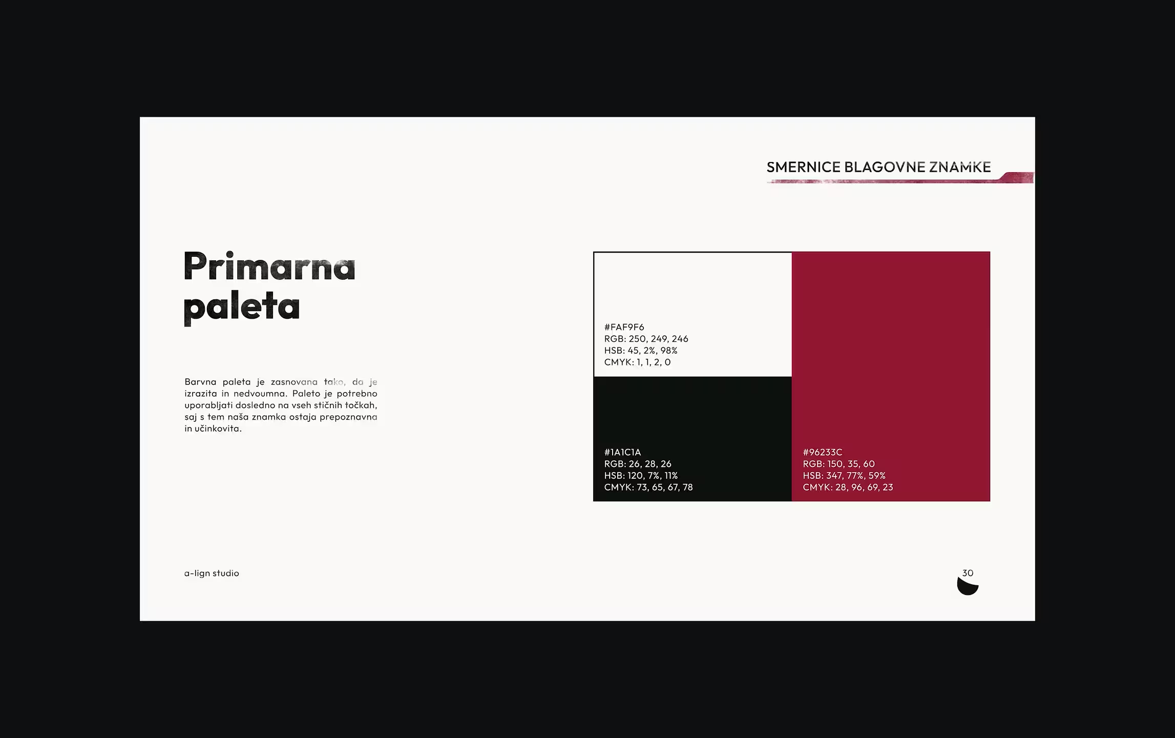
Osnova had been using a deep and warm red as their primary color for years. It carried recognition with existing clients, and it worked. Rather than replacing it, we built the palette around it.
Secondary colors — a muted blue, a warm brown, and a soft green — were introduced to give the brand range. These aren’t used for decoration. They map directly to the kinds of spaces Osnova’s products live in: professional offices, hotel lobbies, restaurant kitchens, medical clinics. The palette feels right because it references real materials and spaces.
The decision to keep the existing red wasn’t sentimental. It was strategic. Osnova’s growth plan involves reaching new clients, but the foundation is still its existing relationships. A color their current clients already associate with them — carried forward into a more considered system — signals continuity. The brand evolved. It didn’t start over.
We chose a typeface designed for clarity, legibility, and wide usability. It’s clean and modern without being cold, which mirrors the brand personality almost exactly. Using a single family across everything — website, business cards, invoices, pitch decks, packaging — eliminates inconsistency.
The typographic rules were set with intention. Headings use tight tracking and leading, which gives them weight and editorial authority. Body text uses wider tracking and leading for readability.
The client had been open to using two typeface families, or even a paid font if it made a difference. We chose a single, totally free, highly accessible family instead — because the constraint made the brand stronger.
We introduced a letterpress-style ink texture as a recurring visual element. It appears on backgrounds, typography, and graphic accents. In a category where most competitors rely on sterile product shots and generic layouts, this texture does something none of them have: it makes the brand feel handmade.
The choice wasn’t only decorative. Osnova sells products people wear every day. The entire sales process is built around touch — fabric samples at the client’s location, fitting sessions, material quality you can feel. The ink texture connects the visual identity to that physical experience. It references the textile industry’s craft heritage without being nostalgic or retro.
Combined with the structured layout system and clean typography, the texture creates a deliberate tension. A company that measures everything carefully and shows up with a smile. The texture is what makes the warm side visible.
The Results
The results aren’t measured in traffic or conversion rates — yet. They’re measured in whether the brand now does what it’s supposed to do.
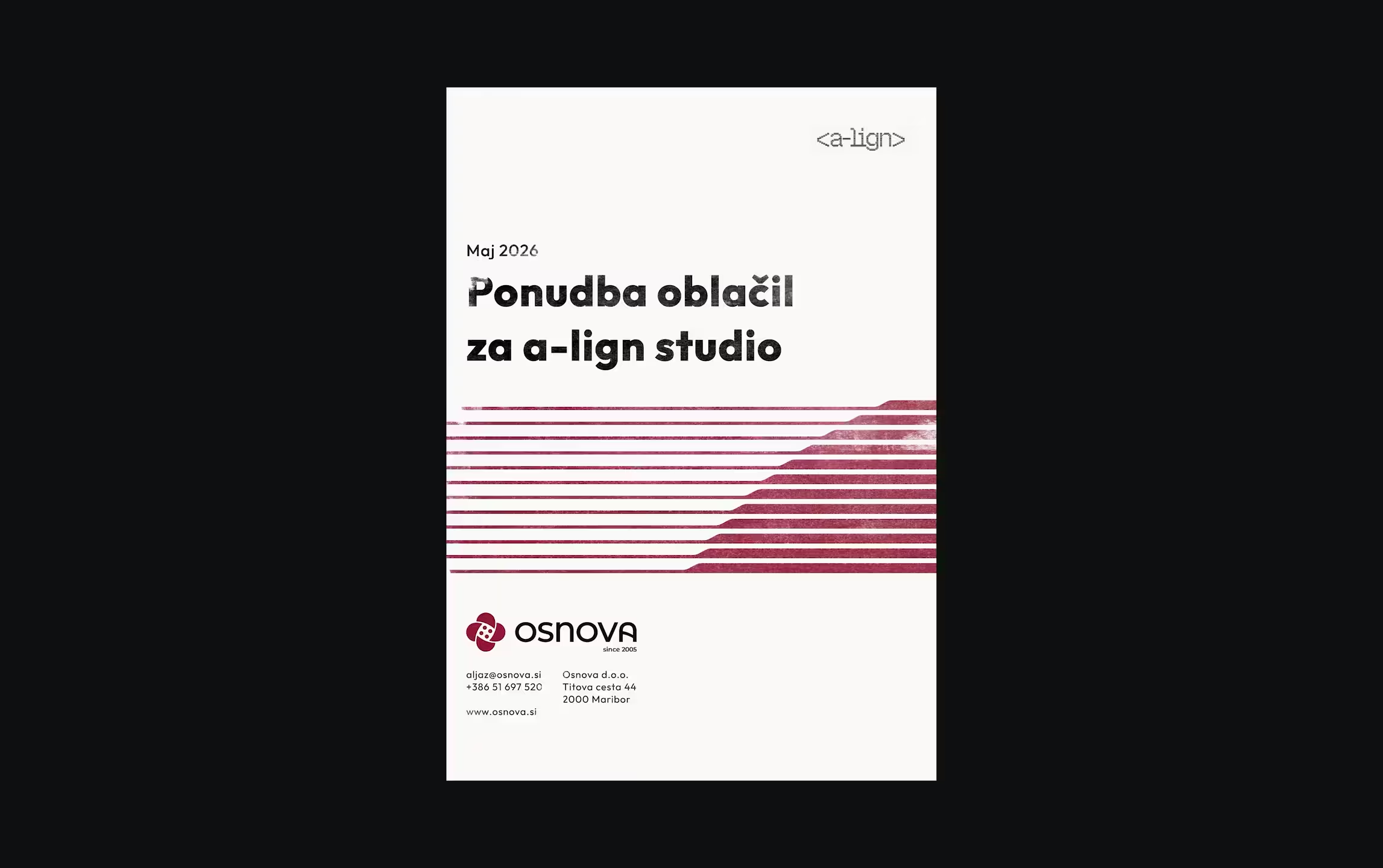
Identity is used across everything — pitch decks, business cards, invoices, social media, packaging, proposals, and client-facing presentations.
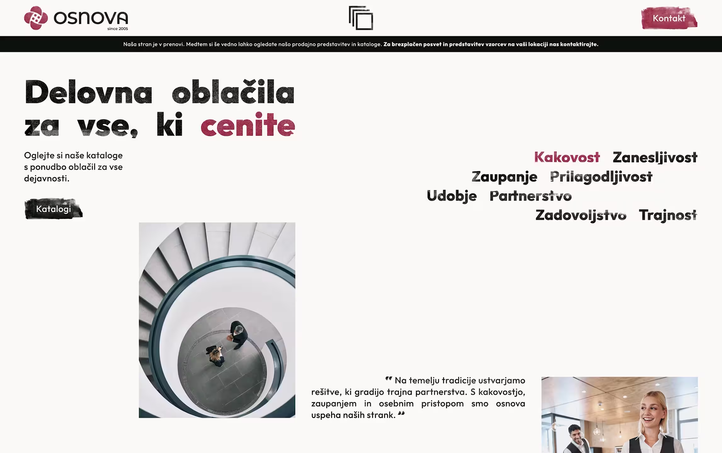
The new placeholder website is live while we build the full version. It’s already giving someone who finds Osnova online a reason to take them seriously before the first meeting.
Osnova signed on for phase two — the full website. The strategy, visual identity, and brand system become the foundation for everything that follows.

“We have been in this business for over 20 years, but we never had a clear brand behind our work. They didn’t just give us a new look, they helped us understand our own business better. Their process helped us see our company from a new angle, and opened our eyes to things we hadn’t even thought about before.”