
The Problem
Kuga Studio didn’t have a website problem — they didn’t have a website at all. The founder had spent years as a choreographer, dancer, and educator. He’d built a reputation in the international dance scene, and he was finally opening a physical space.
The branding was already done — and it was really strong. Bold, confident, urban. But there was nothing digital to carry it. No place for people to find the schedule, understand the program, see the mentors, check pricing, or enroll. Everything was being handled manually — direct messages, word of mouth, social media posts. It worked for the inner circle, but it didn’t scale.
The challenge wasn’t just building a website. It was guiding the team that had no experience with web projects. They didn’t know what to prioritize, what to put where, or how to structure information for someone visiting for the first time. They needed someone to lead, not just execute.
We knew each other through the dance scene. Trust was there from day one, but so were the expectations.
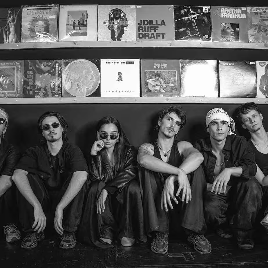
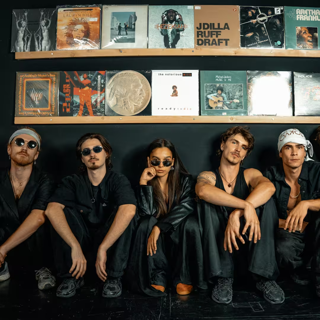
The challenge wasn’t just building a website. It was guiding the team that had no experience with web projects. They didn’t know what to prioritize, what to put where, or how to structure information for someone visiting for the first time. They needed someone to lead, not just execute.
We knew each other through the dance scene. Trust was there from day one, but so were the expectations.
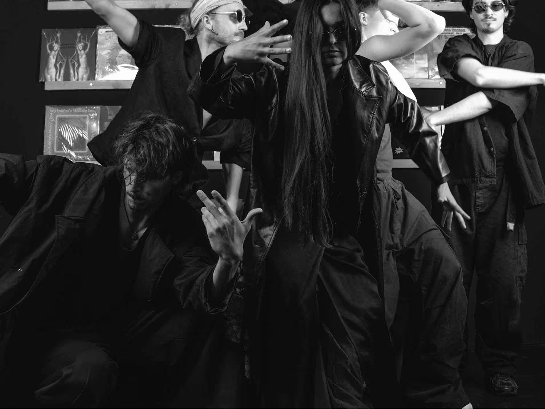
The Strategy
Same process as every project — discovery, strategy, design, development. But the starting point was different. Kuga had a strong brand and a clear identity in person.
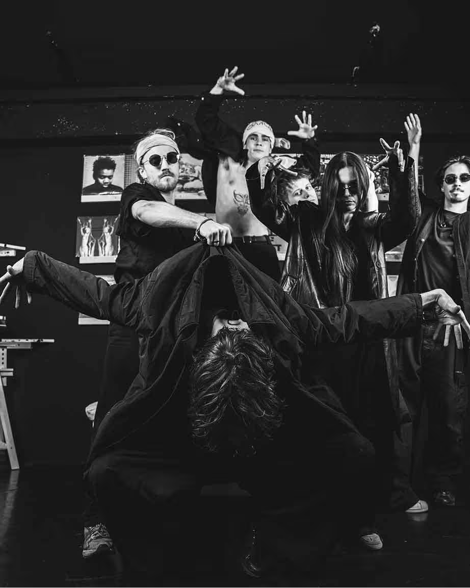

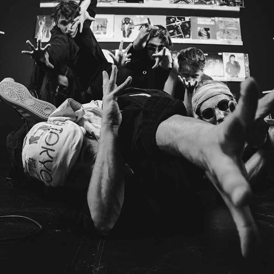
First, we needed to automate the basics. Team was spending time answering the same questions over and over — schedule, pricing, how to enroll, what styles they teach. The website needed to handle that so the team could focus on teaching, not admin.
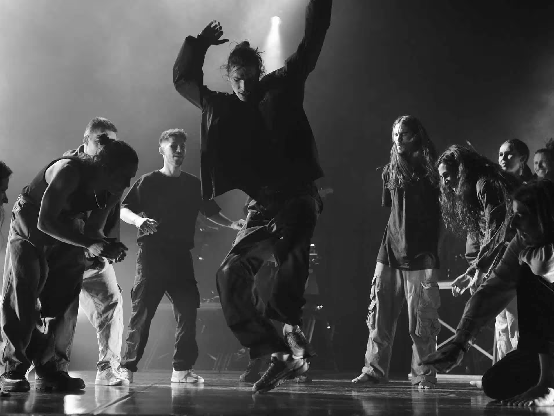
Second, we needed to show what makes Kuga different. This isn’t a traditional dance school. It’s a studio built around a specific philosophy — freestyle, improvisation, individual expression, and community. The website needed to carry that difference without over-explaining it to death.
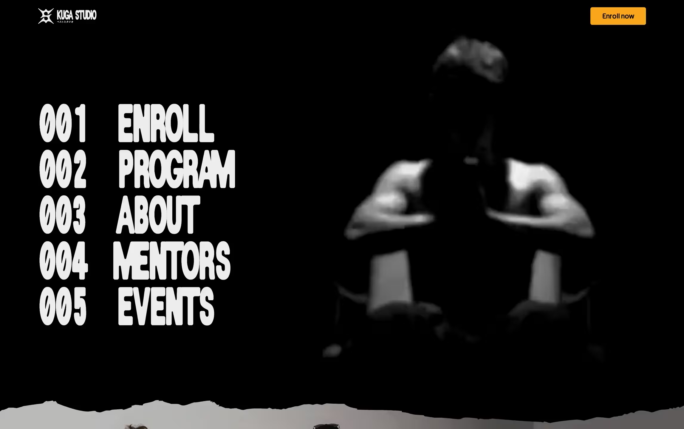
We mapped out the site structure around clear user journeys. Someone discovering the studio for the first time needs to understand what it is. Someone ready to join needs pricing and enrollment. Someone already enrolled needs the schedule. Every page serves at least one of them.
The Decisions
A first website is all decisions. There’s no old version to reference, no existing structure to build on. Everything starts from zero. These are the ones that mattered most.


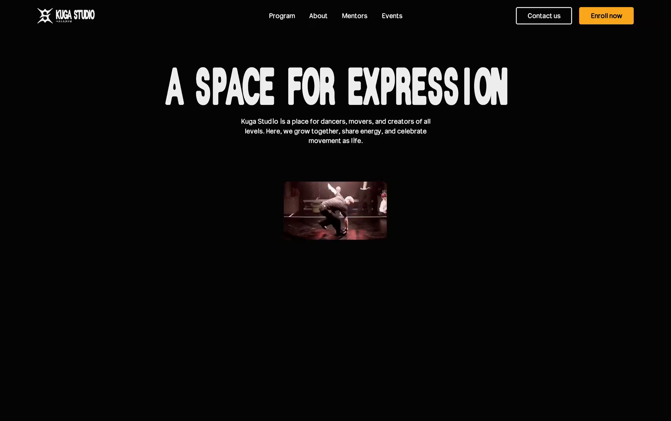
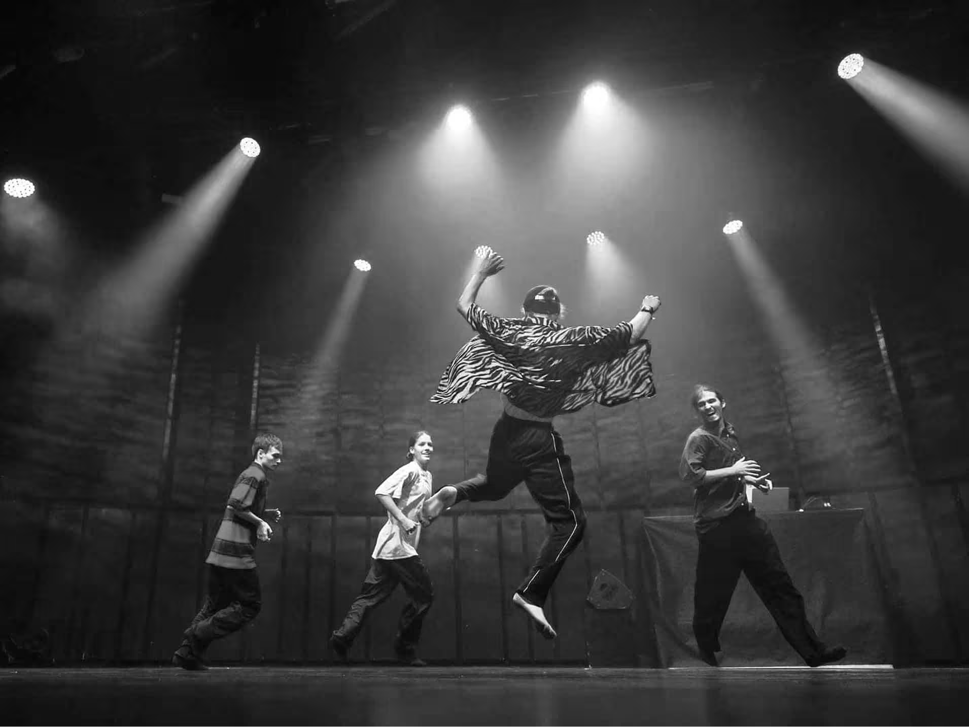

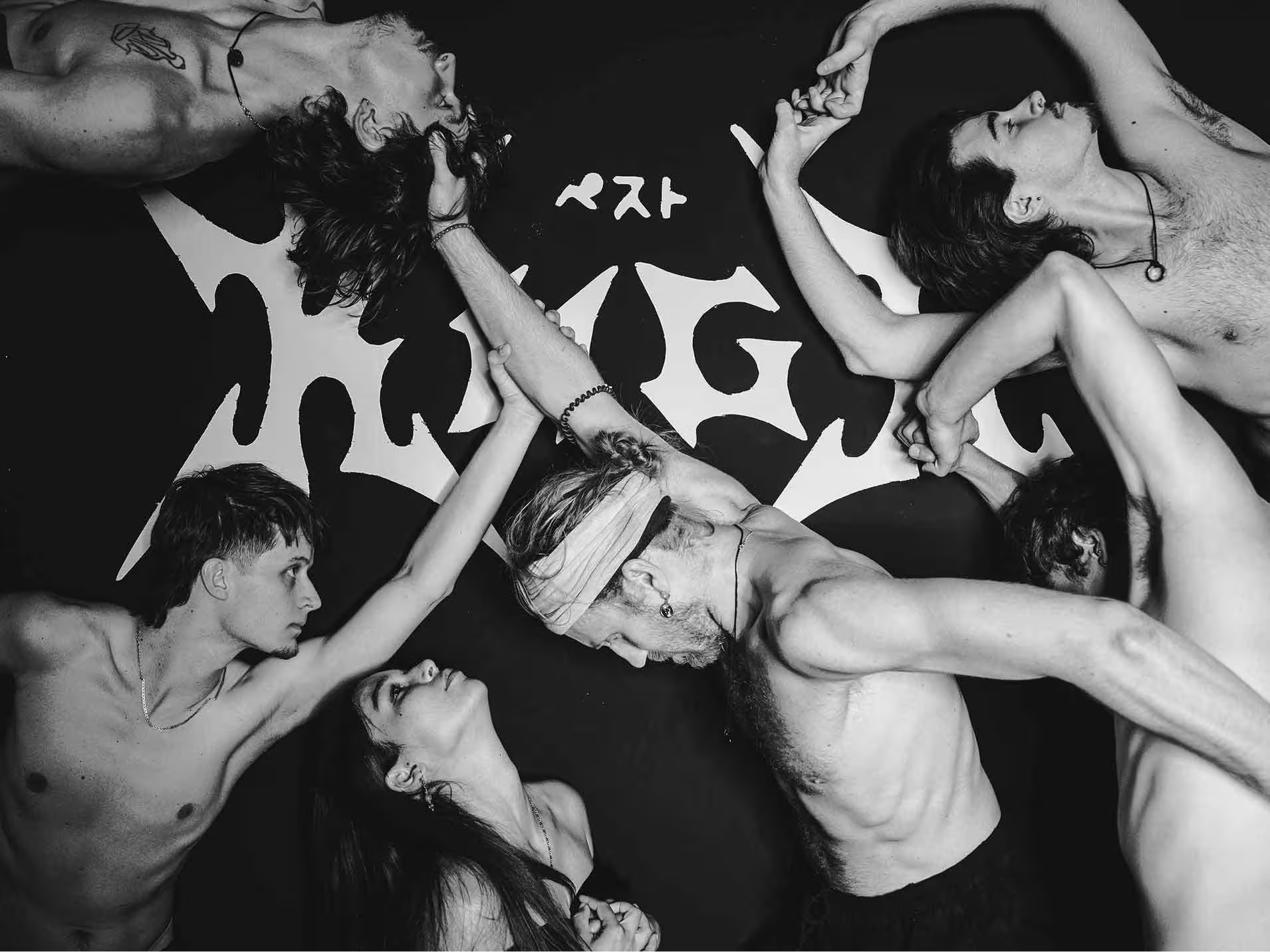
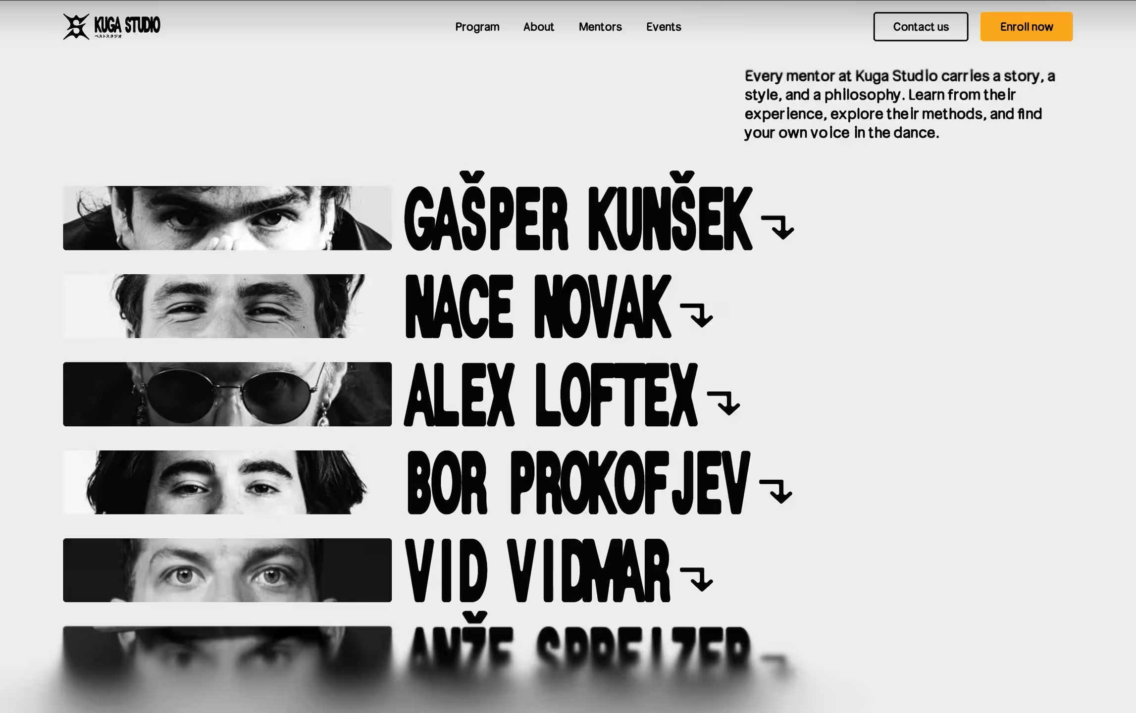
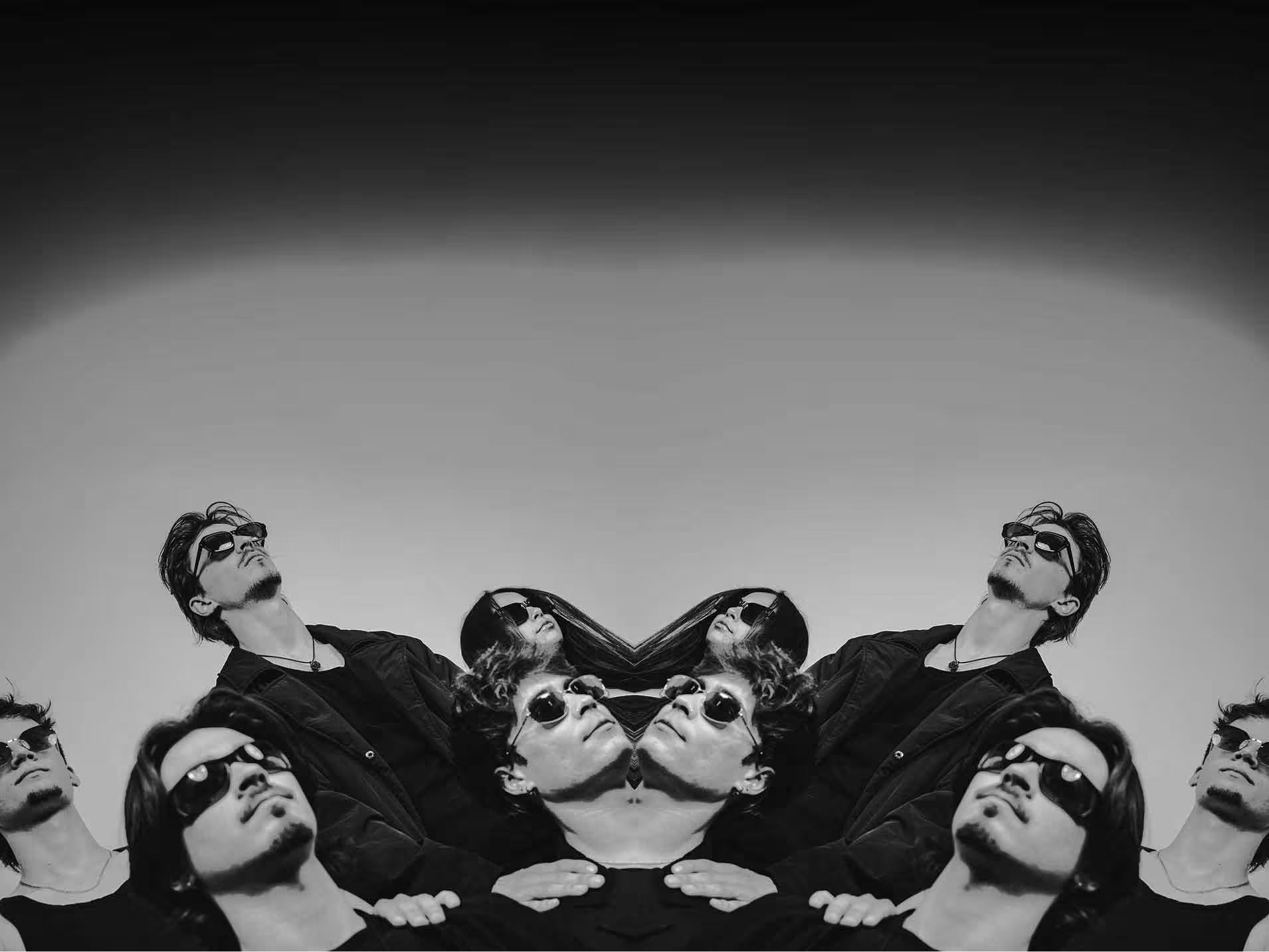
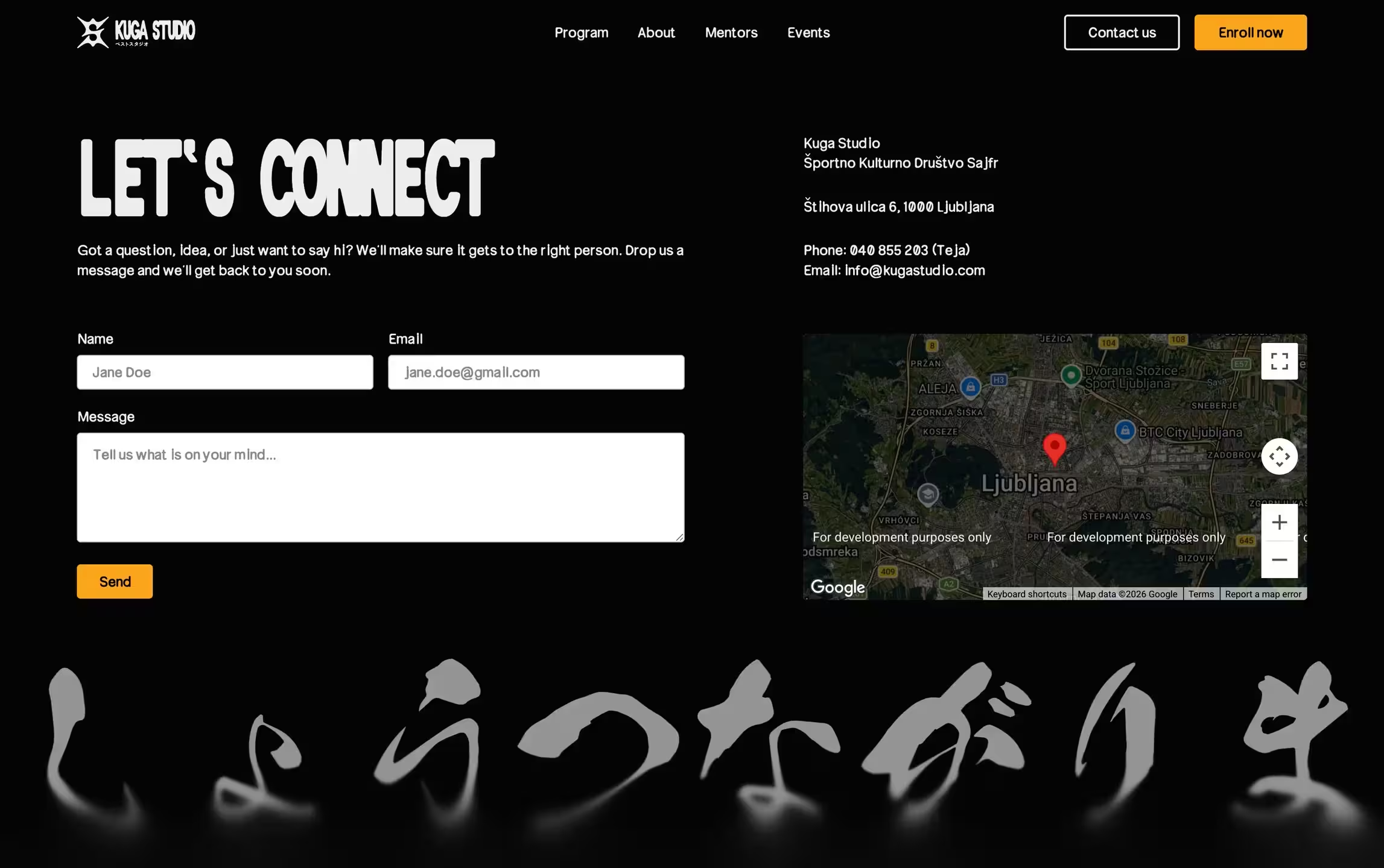
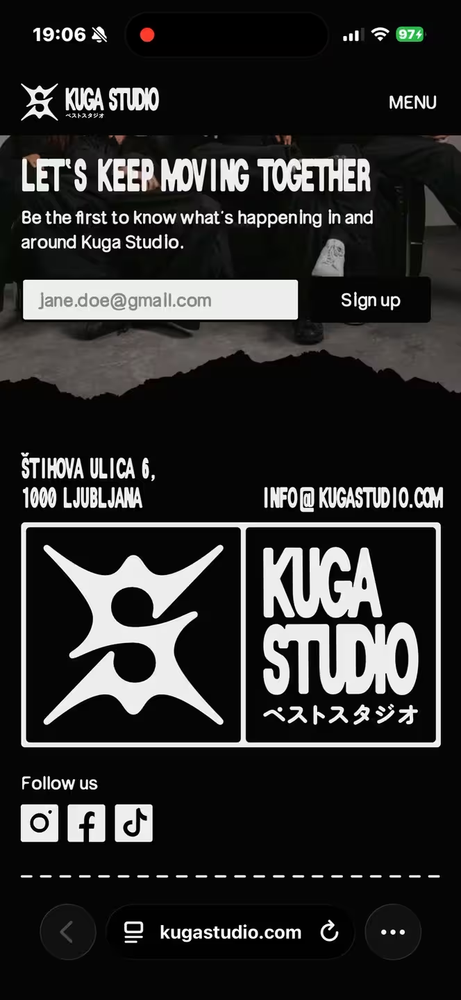
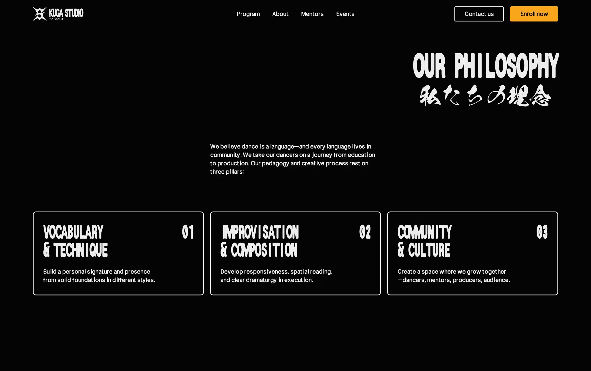
The existing brand identity was strong — bold typography, high contrast, a raw energy that matched the studio’s personality. It had been brilliantly working on posters, social media, and print. Translating that to a website without killing the vibe or the usability was the biggest design challenge of the project.
We kept the character of the branding but adapted it for how people actually use a website. That meant adjusting type sizes, spacing, and contrast for readability on screens. It meant choosing where to let the design be loud and where to pull back. The homepage could be more expressive and visual. The program page, the pricing page, the enrollment form — those needed to be clear first and interesting second.
The result is a site that feels like the brand from the first scroll, but never gets in the way of what people came to do. The bold moments hit harder because they’re surrounded by space and structure that lets them breathe.
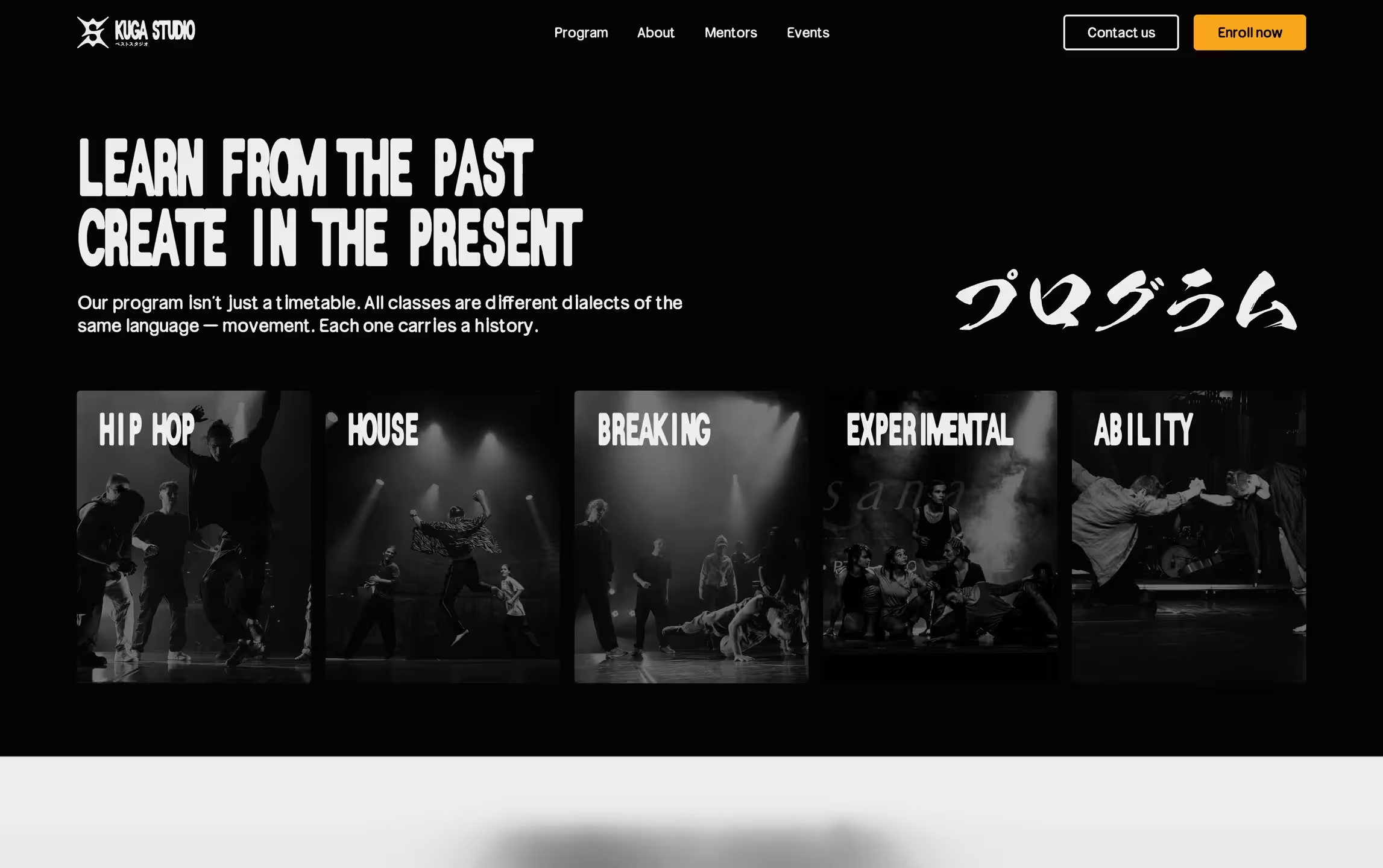
Kuga offers five distinct styles with multiple levels, different mentors, and a weekly schedule that changes by day. For someone on the inside, this all makes sense. For a first-time visitor, it’s a lot.
We separated the program into two layers. The first explains the styles — what they are, where they come from, what you’ll learn. The second is the schedule itself — a clear, scannable weekly grid that shows what’s on, when, and with whom. The styles give context, the schedule gives logistics.
This structure also let us connect mentors to their classes naturally. Each style links to the mentors who teach it, and each mentor profile lists what they teach. Two ways into the same information — one for the person who’s interested in a style, one for the person who’s interested in a teacher.
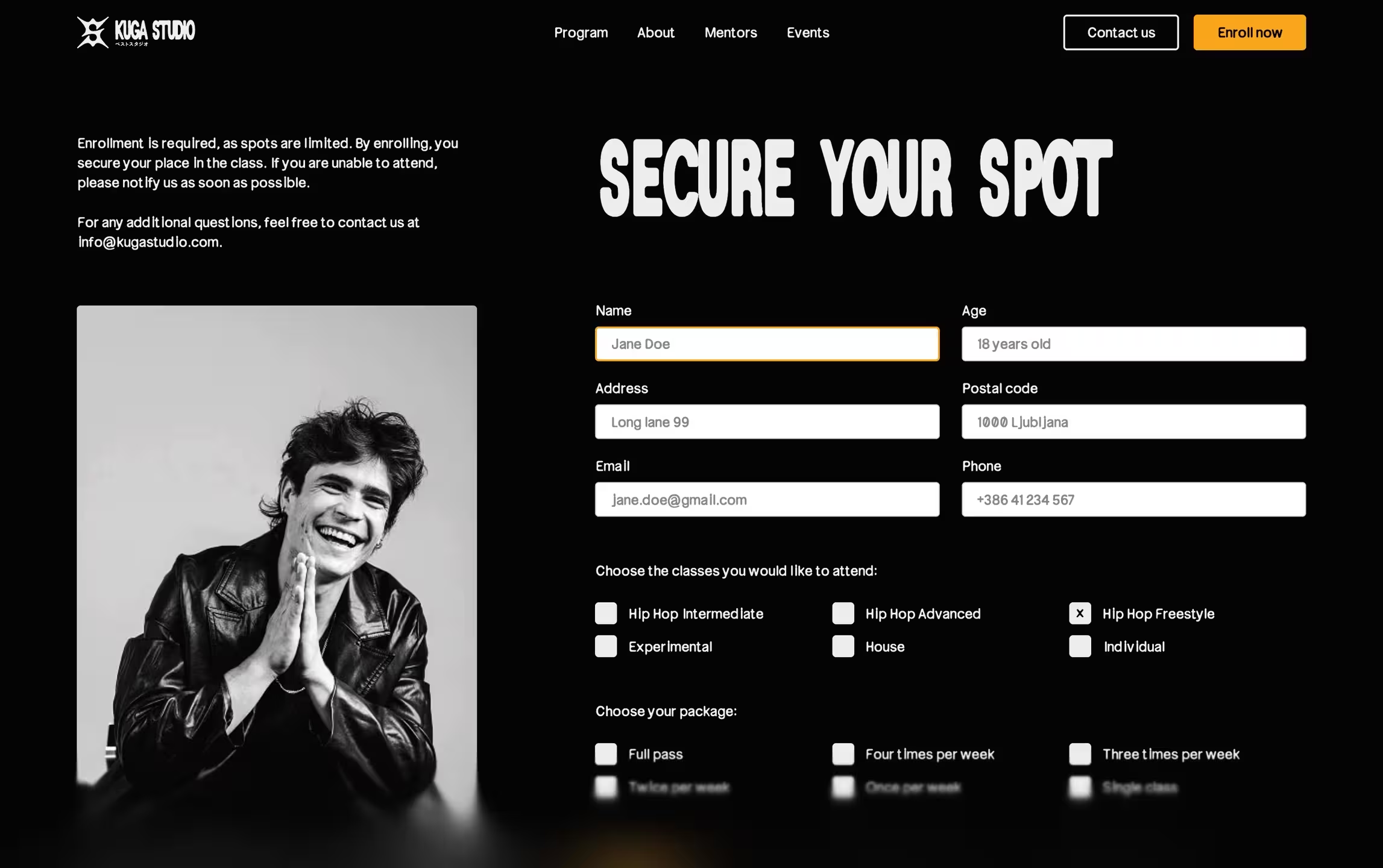
There was no existing system for enrollment. Before the website, people signed up through direct messages or in person. We needed to build something that formalized the process without making it feel too official — this is a dance studio, not a government office.
We designed an enrollment form that collects the essentials. It’s informational by design. The legal enrollment still happens in person with a signed form on the first visit. The online form reserves the spot and gives the studio the information they need to manage capacity. We made that distinction clear on the page so nobody’s confused about what they’re signing.
The form also feeds directly into how Kuga manages its classes. Instead of chasing people down for details, the studio gets structured data before the student even walks in. That alone saves hours of back-and-forth every week.
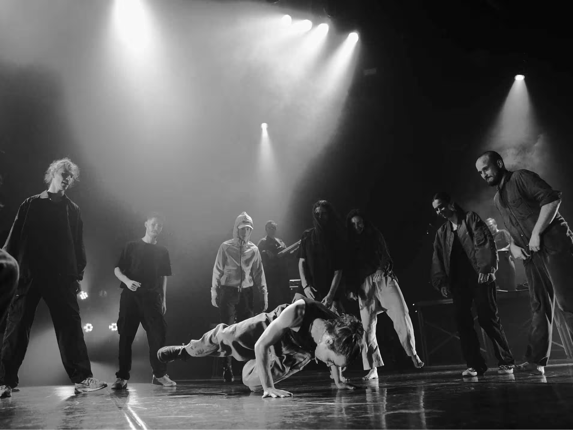
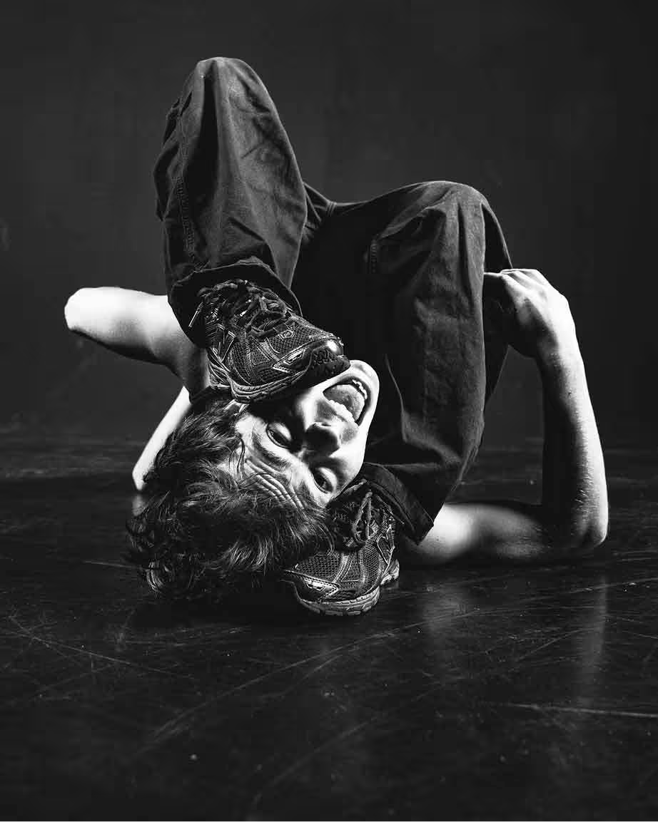
Most dance studio websites bury their teachers in a sidebar or a list at the bottom of the about page. We gave them their own page. Each mentor gets a full profile — bio, teaching principles, the classes they lead, and visuals that carry their style. Not a headshot and a title. An actual moving introduction.
This decision came from the strategy. The mentors are one of Kuga’s biggest differentiators. These aren’t part-time instructors — they’re active dancers, performers, and creators with international careers. When someone is choosing between studios, the people teaching are often the deciding factor.
It also gave the site more depth. Instead of a flat “about us” section, visitors can explore the people behind the studio individually. Each profile reinforces the philosophy — diversity of styles, individual expression, community — without having to say it in a paragraph.
The team wrote the first draft of the copy. We edited it, restructured it, and tightened it — but the voice stayed theirs. A dance studio’s personality is how it talks to its community. If we’d written everything from scratch, it would’ve sounded generic. Their words, cleaned up and placed properly, sound like Kuga.
Photography was covered. Video wasn’t. We presented concepts for how video could work across the site — mentor introductions, studio atmosphere, class energy — and showed the team where each type would live in the design. They handled the recording, we prepared everything for web use. The result is a site that moves the way the studio does.
We also built the site on Webflow with a CMS structure that lets the team manage what changes most. The goal was a website they could actually maintain without calling us every time something needed updating. If the content goes stale, the site stops working. So we built it to stay alive.
The Results
Kuga Studio launched and the website went live alongside the studio itself. Brand new studio in a niche market, no prior digital presence and no paid advertising.
The site handles what it was built to handle. People find the schedule, check pricing, read about the mentors, and enroll — without messaging the team directly.
The site won a GSAP recognition for animation and interactive quality that puts it alongside some of the best-built websites on the web.

“Tamara and Jan are the kindest people, so easy to work with. They really have a unique skill of understanding your vision. They ask the right questions, listen closely and make ideas into something that feels truly yours.”