
The Problem
Reyou had been operating for three years, completed over 10,000 treatments, and recently invested in a full brand identity. The foundation was there but the website wasn’t.
The previous agency had delivered something that looked decent on the surface but the structure didn’t support what the site was supposed to do. Pages were mashed together, SEO was broken, there were no user journeys for different patient types, and no system for scaling as new clinics and treatments launched.
For a clinic treating people with depression, anxiety, and PTSD — people who need clarity above all else — the site was making things harder, not easier.
Reyou’s founder had already done a lot of the thinking. He provided the copy for almost all pages, a rough sitemap, and a brand book. He didn’t need someone to tell him what his business was. He needed a team that could present it properly — without losing what made Reyou feel like Reyou.

For a clinic treating people with depression, anxiety, and PTSD — people who need clarity above all else — the site was making things harder, not easier.
Reyou’s founder had already done a lot of the thinking. He provided the copy for almost all pages, a rough sitemap, and a brand book. He didn’t need someone to tell him what his business was. He needed a team that could present it properly — without losing what made Reyou feel like Reyou.


The Strategy
Reyou came to us with more preparation than most clients. That made the strategy phase faster — but not less important.

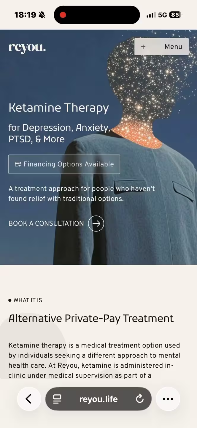
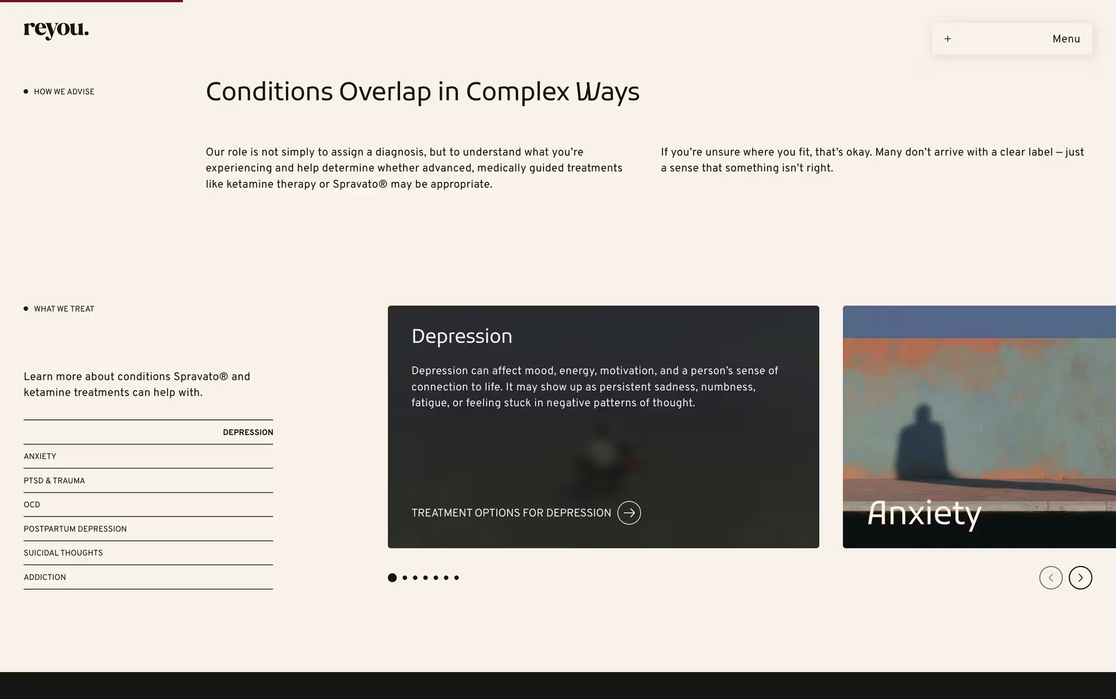
The first thing we needed to get right was who this website was actually for. People researching treatment for the first time. People comparing options. And loved ones searching on someone else’s behalf. Each group needs different information, in a different order, with a different emotional tone. The old site treated them all the same. Ours couldn’t.
The competitive analysis showed a clear gap. Reyou’s competitors all leaned either clinical or spiritual. Clinical sites felt cold and transactional. Wellness-focused sites felt vague and ungrounded. Nobody was sitting in the middle: medically serious but emotionally warm. That’s where Reyou belonged — serious enough for the skeptics, warm enough for people in pain.
From there, every decision had a foundation. The sitemap, page hierarchy, content structure, CMS architecture, user journeys, SEO and AEO targets — all of it came back to three things: who’s visiting, what they need to know, and what should happen next.
The Decisions
Strategy gave us direction. Decisions were where it showed up. These are some of the calls we made during the project — the ones that shaped what Reyou’s website became.






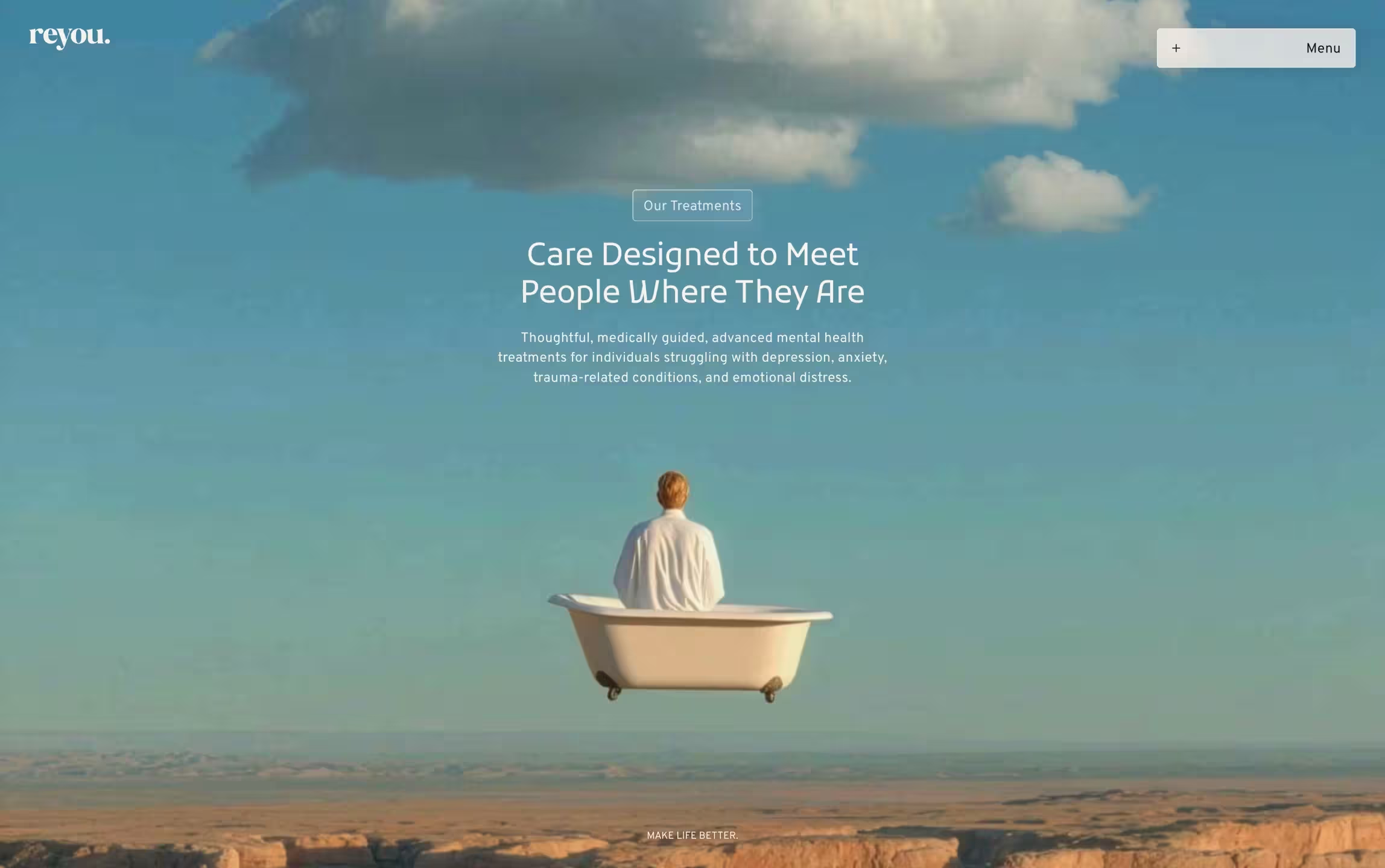

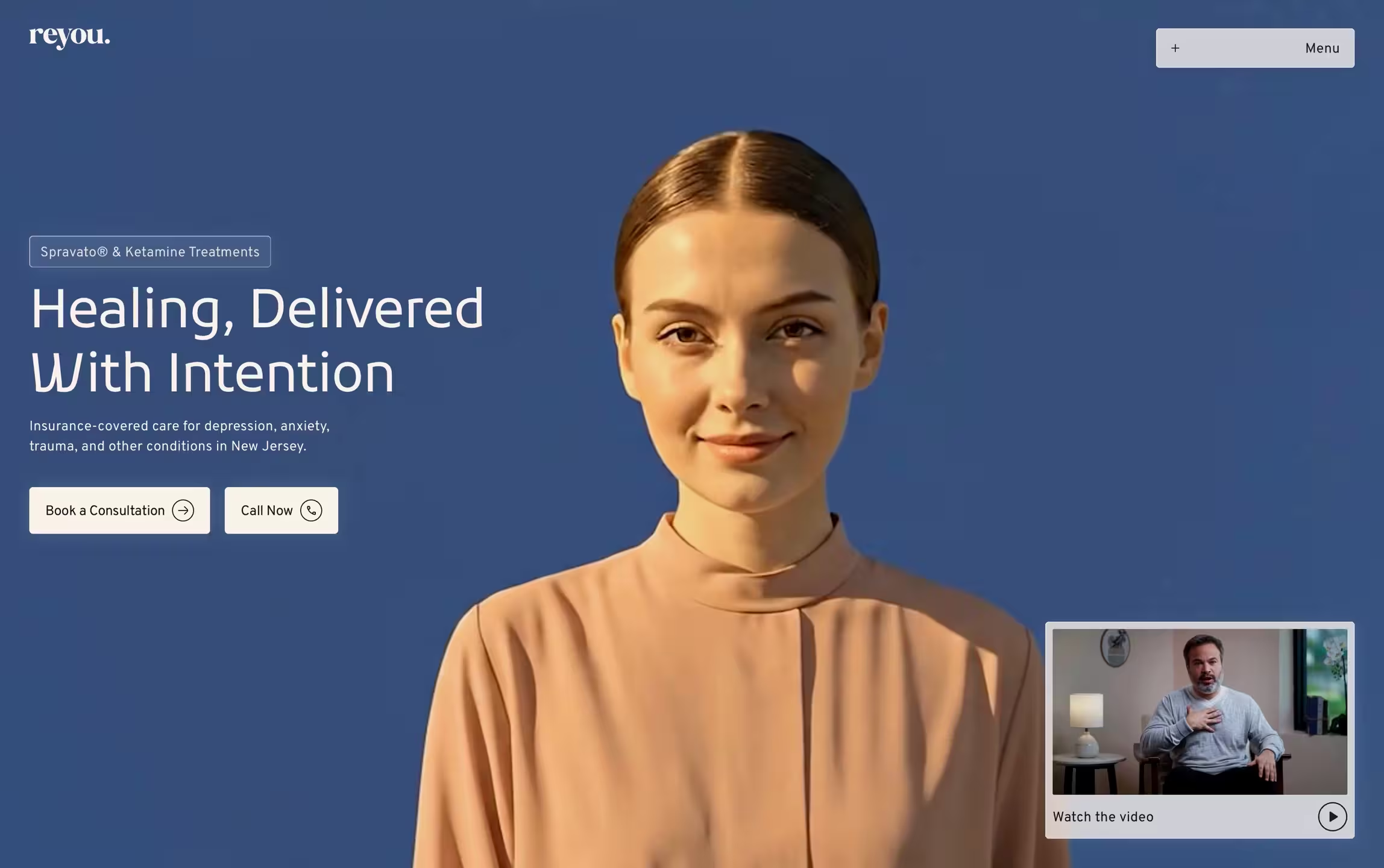

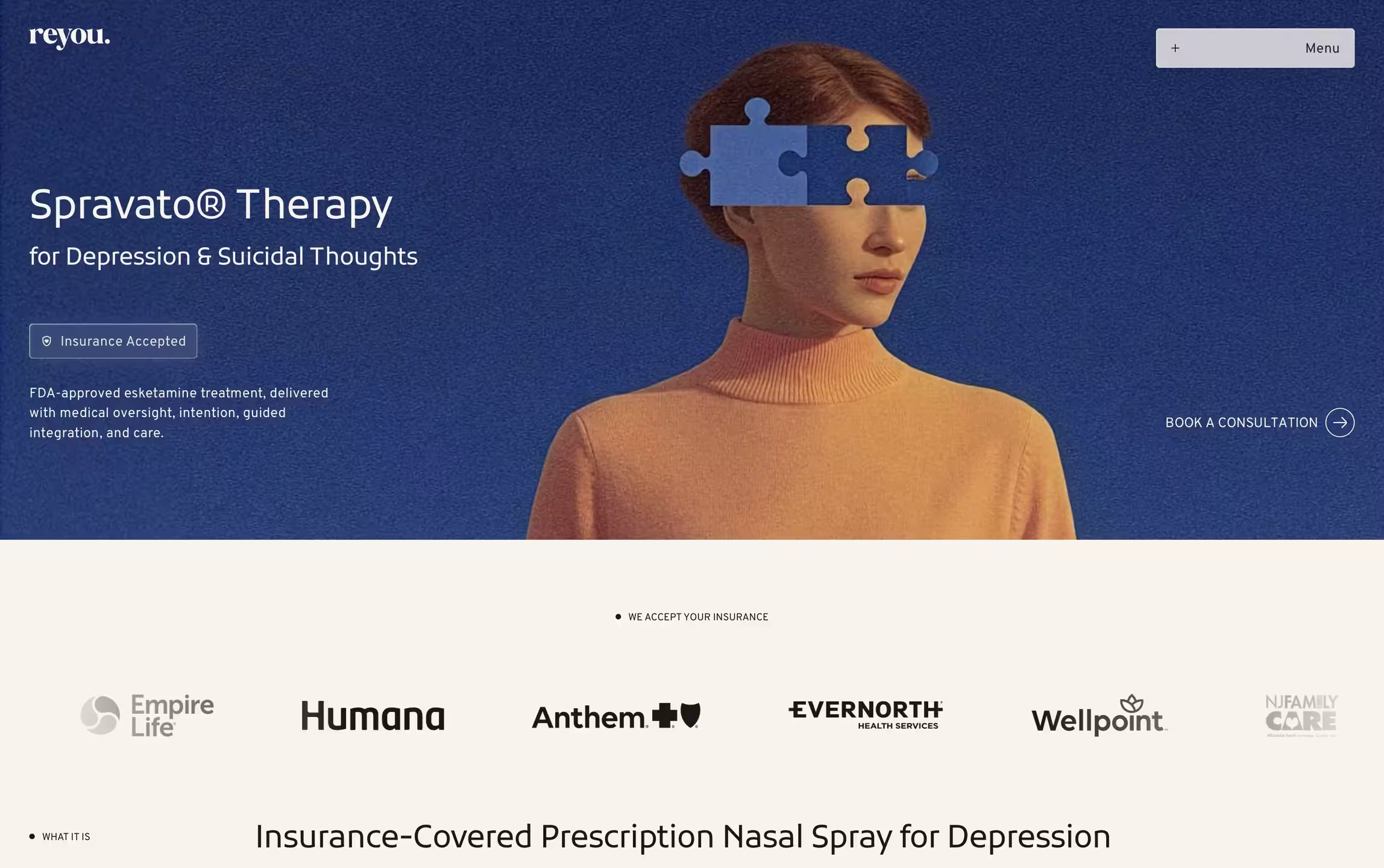
The original ask was to keep the existing page and refine it. We pushed back after reviewing it — not on the aesthetic, but on the foundation. The old site was built in a way that made it nearly impossible to scale. Pages weren’t componentized, the CMS wasn’t structured for different repeatable content types, and the SEO setup was fundamentally broken.
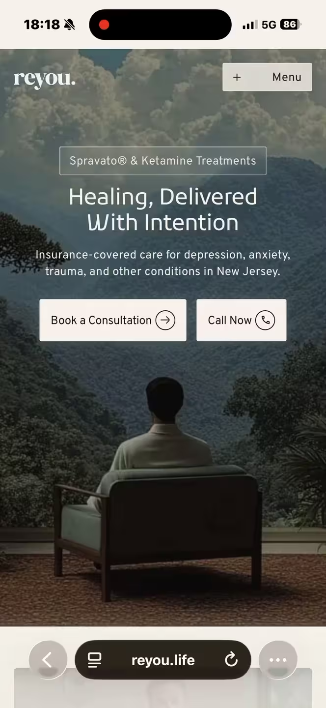
We kept the visual language — the same fonts with optimized settings, intentional use of existing colors, same imagery style with improved quality, and overall brand feel — but refined it for web use and rebuilt everything from zero in Webflow. New variables, new component system, new CMS architecture. The old site stayed live the entire time. When we launched, it was a single switch with no downtime.
The result was a site that looked like a refined version of what Reyou already had, but worked completely differently underneath.
The people visiting this site are often in real distress. The design needed to feel safe before it felt impressive. We preserved what was already working and refined how it’s used. We removed what wasn’t working and added what was missing.
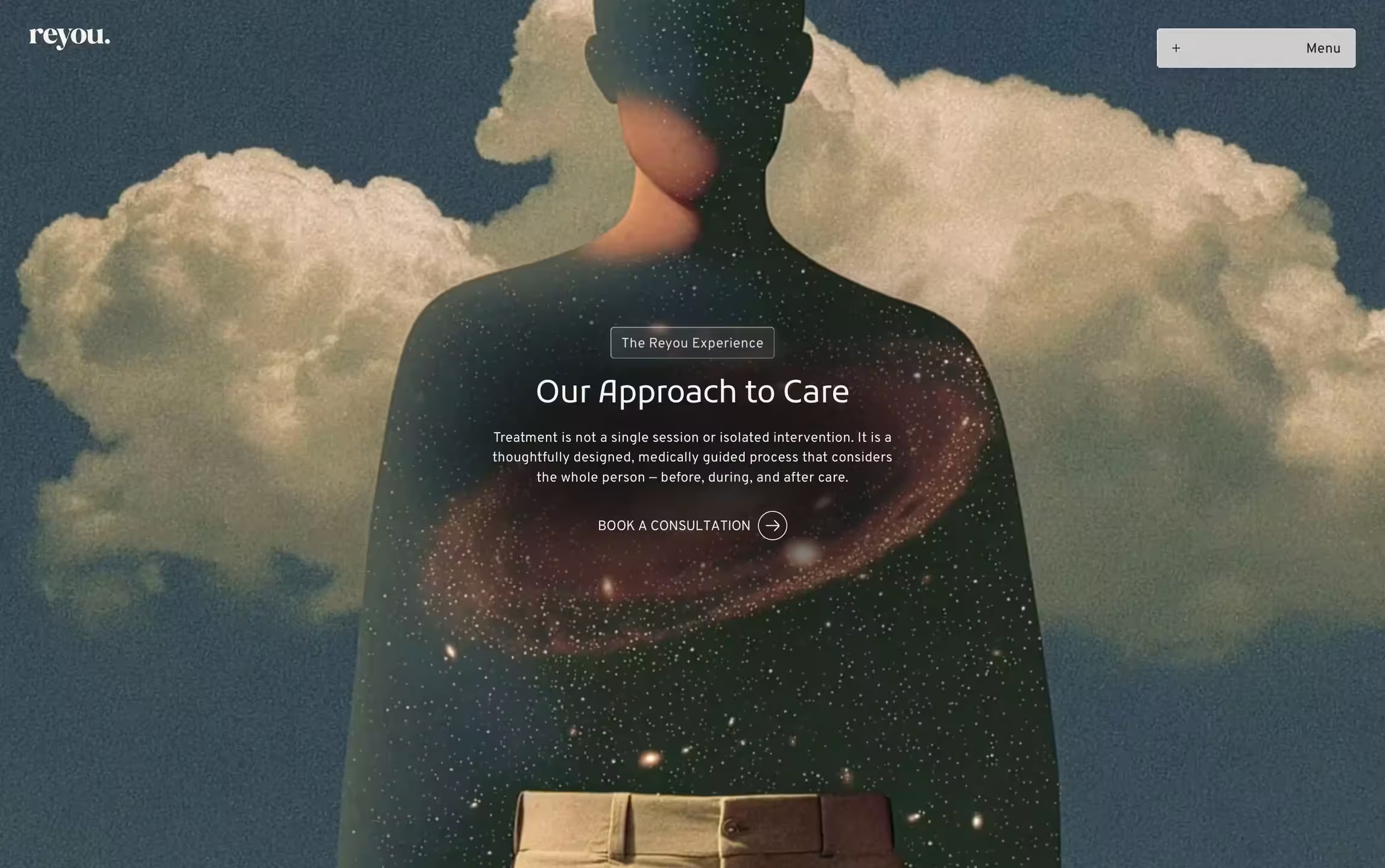
Typography and color palette followed a hierarchical structure. We introduced frosted glass throughout the site — not as a trend, but as a way to create depth and draw focus. Layouts use proven patterns to guide the eye without effort, and repetitive structures across pages prevent cognitive overload. Every image was upscaled and placed intentionally to support, not compete.
The overall effect is a site that feels professional and trustworthy without ever feeling cold.
Most websites use animation to feel fast. We used it to feel steady. Reyou’s patients are already overwhelmed. A site that hits them with sharp transitions, aggressive effects, and snapping elements would work against the very experience Reyou provides in their clinics.
Every animation on the site uses soft motion. It sets the emotional tone before a single word is read. When we were asked to speed up the animations, we explained our reasoning: people in mental health crises shouldn’t be rushed, and a calm motion mirrors the feeling Reyou’s physical spaces aim for. We found a middle ground — quicker, but still gentle.
Animations reveal content progressively rather than all at once, giving visitors time to absorb what they’re reading. Interactions — hover states, menu transitions, accordion expansions — follow the same principle: support the user, never surprise them. The motion isn’t decorative. It’s part of the care.
Reyou’s audience is cautious by nature. They’ve often been let down by previous treatments, they’re skeptical of anything that sounds too good, and many are nervous about psychedelics. Trust isn’t built by saying it. It’s built by placing proof where doubt shows up.
We mapped where hesitation shows up in each user journey and placed trust signals accordingly. The insurance logos, a custom video player, short testimonials from real patients, stories from patients treated for specific conditions, staff credentials and their clinical background, verifications and other compliance badges, treatment count, and crisis sections across the pages.
None of these elements were afterthoughts. They were designed into the page structure from the start, placed at the exact moments where a visitor’s confidence needs reinforcement.
Reyou had two clinics at launch, they offered two treatment types, with a third in development. They treated several conditions, with more likely to follow. And they also wanted a blog that could grow alongside the business.
We built the CMS to handle all of this without needing a developer. Conditions, treatments, locations, team members, testimonials, and blog posts — each has its own collection with structured fields, conditional visibility logic, and automatic connections to the pages that reference them. Adding a new condition page, for example, takes minutes. The content populates across the site without touching the design or code.
Reyou’s team can manage all of it through a custom Webflow role, with protected fields for anything that could break the functionality or layout.
The Results
Within the first month from launch, the numbers told the story and backed up the thinking.
Phone calls and form interactions doubled across the board. Same traffic, twice the action. People weren’t just visiting — they were doing something about it.
The rebuild showed up where it matters. Within weeks, Reyou was ranking on first page for many keywords. For a site that had essentially no SEO foundation before, that’s big.
After launch, we added three landing pages for Google Ads, which helped push paid search sessions up a lot. The website is now a tool that grows alongside the business.

“You’re both excellent people to work with and I appreciate you guys as a team. You guys are on top of your shit and it shows. I think you are good and tenacious problem solvers.”